Showing posts with label layout. Show all posts

Friday, 7 March 2014

Jungle Grumble: How it's Going to Look


I managed to get all my Jungle Grumble finishing work done in time, so that's me finished until proofs come back from the printer. 

The publisher is now setting up the final designs. My designer at Piccadilly sent me low-res versions of how the spreads will look with text. Now she has my finished digital illustrations, she will be fine-tuning the designs and placing all the text into position, ready for proofing. This is how the first spread is going to look:


They have also created designs for the 'extras', like the back cover and the title page, using sections from the existing illustrations. This is the title page design:


It's all perfect timing, because of course I am out of the studio most days at the moment, visiting schools. Today I am actually in a school in Sheffield, so nice and close for a change, but sadly no chance for train sketching.

Wednesday, 22 January 2014

New Film: How I Design My Picture Book Illustrations


Yes, at last John and I have got another film finished - hurrah! 

I thought it might be interesting to use the work I have been doing on Julia Jarman's story, Jungle Grumble, to talk people through how my picture book illustrations are created. 


This is the first of two films about creating a set of roughs (the next one will be out in a week or so). This first film talks you through how I get from a simple sheet of typed text, emailed from the publisher, to a set of finished designs. 

I show you how thumbnail drawings work as a great way of capturing first thoughts, then how those are enlarged and redrawn in various stages. I talk about using a layout template and how I work around the text and the central gutter. I don't like to draw at a computer, but it is still an invaluable tool and I explain in the film how I use it to move the drawings forward.


The films John and I have created over the last year have been made as a direct result of writing this blog. Telling my readers about what I do has been really useful for me, as it makes me analyse my process and consider precisely what it is I am doing at the various stages. When you've been doing something for so many years, it can be hard to explain it to other people, because so much of the process becomes second nature.

If there is any aspect of my work which you would like to know more about, do please let me know. In the meantime, I hope you enjoy the film. If you do, please leave me a comment. And it would be wonderful if you could help me by spreading the word on Twitter, Facebook etc, because every little helps!

Thursday, 5 September 2013

Designing a Picture Book Spread: Placing Text


I thought it might be interesting to use my work on Jungle Grumble to talk about how I design around text. One common error made by would-be children's book illustrators, is forgetting that quite a lot of space needs to be created in your illustration for the words.

This can be a challenge if the illustrations need to be busy. Though ideally the text is evenly spread through the book, this is not always possible, depending on the action. Some spreads can end up very 'text-heavy'. Others have lots of dialogue and all those new lines make the text expand down the page:


Before I put pencil to paper, I always ask my publishers to set the book's text in the chosen font, at actual size, so I know exactly how much space is needed. I then create blank templates for each spread in Photoshop (as above, with the gutter clearly marked), into which I place the text.

Obviously, until I have drawn the illustrations, nobody knows where the text needs to be positioned, so I am okay to move it around, as long as I follow basic design rules (like keeping an appropriate distance from the top / edges / gutter). 

Mostly I keep the specified text on the particular spreads suggested by the publisher although, with Jungle Grumble, I did make a couple of changes. For instance, in my brief, this text at the very beginning of the story was split across 2 spreads: 


Which seemed an unnecessarily slow start and, by combining both sets of text into one illustration, I freed up an extra spread for later in the book, which was very handy when we were in the thick of the action.

While doing the first thumbnails, I estimated the text area needed:


I then enlarged all the thumbnails and popped each into one of my Photoshop spread-templates. Dragging the bits of text into the positions my illustration idea demanded, I was able to see where more space was needed and rearrange the compositional elements accordingly. 

Below is the spread that fits the template at the top of this post. You can see how I have divided the block of text into 3 sections, to make it more palatable to the reader and also easier to draw around. I have then placed the proper text in position on the enlarged thumbnail, replacing my estimated, hand-drawn text. This one fitted the actual text really well: 


Using layout paper over the thumbnail print-out (which is translucent, allowing me to see enough of the thumbnail to guide me, but not too much, so no visual distraction as I redraw), I reworked the illustration, making sure I didn't get too close to the text.

My new drawing was re-united with the text when it was scanned and placed back into the Photoshop template, in place of the thumbnail:


Of course, the designer will now rework the text layout - mine is just a suggestion for how I think it best fits my illustrations. Sometimes it stays as is, other times they have ideas to make it funkier.

Thursday, 30 May 2013

Swap! Layouts - the Design Process


There are a few places in Swap! where, instead of one image on the page, there are two or three little vignettes. These can just sit on a plain, white background, but the design of Swap! uses a pastel coloured palette throughout and I envisaged these little illustrations sitting either on a coloured background, or a page divided between two contrasting colours.

When my designer send the layouts, she had done something I didn't expect. She used the pastel colours, but in combination with a white background (ignore the little, red oblongs: they are just editing notes): 


I like the freshness the white lends things, but feel the design leaves insufficient room for the text and everything seems too cramped.

So I had a play, to see if I could make the idea work better. I tried different shapes and ended up with this, which keeps the white border but, by making the shapes big enough to encompass some of the text, allows things room to breath:


But any design of this kind needs to follow through the whole book, so I went over each of the vignette pages, trying to make them match my theme. They all had different challenges, so no two worked out quite the same...

There was more going on in these illustrations, so I couldn't manage the white split between the shapes, but by keeping the outer border and the diagonal split, it's a good enough match:


This one was tricky, as four images meant even less room on the page. Again, I felt the original idea from my designer had the shapes a bit tight against the text:


So I did away with the white between the images as before, then played around until I could find two diagonals which created shapes that fitted the illustrations. Again, shifting the majority of the text inside the shapes makes it feel much roomier:


We decided that this page worked best on just one colour, as the 3 poses are happening very quickly after one another and the pink makes it all suitably 'girlie'. I've kept the diagonal split though and the element of fragmation creates extra fun, because it adds to the sense of chaos:


I've had these designs approved now, so it's full steam ahead!

Monday, 27 May 2013

Swap! - the Final Edit


Yes, I am still working on Swap! 

Because of all the changes at the publisher's end and the publication date of Swap! therefore being bumped on a year :-( it has been an especially drawn-out process this time. Usually the different stages follow on from one another pretty rapidly, but this time I am having to be very patient. 

It's all working well though, despite being a little odd: my original Editor and Designer from Gullane have been allowed to continue working with me, just long enough to see Swap! safely through to proof stage. They have been doing a great job behind the scenes, fine-tuning the book. 

I was recently emailed a set of layouts to approve, before we go to the actual printed proof. It is so exciting to see things come together, to see all my illustrations and my text finally fused into one. 

It's looking great. Above you can see the final cover design. Remember all the different design ideas we went through to get it just right? I love that we have been able to use white text for my name, not black, by cleverly reversing out of the turquoise (Paula, my designer was the clever one, not me!).

She has also been using illustrations from within the book to create 'extras' like the title page spread:


I went through the new layouts with a fine tooth comb. There were still lots of little tweaks I wanted to make, both to the text and to the design. It was tiny things on the whole: the odd typo; changing a word here and there, to give a slightly different shade of meaning ('he sighed' instead of 'he said'); or nudging a bit of text over a little, where it cramped the image.

There was one more complex and interesting design problem to solve, but I'll leave that until next time, so I have more space show you the ins and outs of things... 


Thursday, 25 April 2013

Library Mural: Designing the Layout


A while ago I mentioned a mural project that I am doing, based on children's drawings created during an illustration workshop, focussing on characterisation and movement. The wall I have to cover, at Wakefield Library, is over 13 metres long, but only 2 metres high - very long and thin - so the idea is to create a chase scene along it, as if the children's animals are running through the library.

I let the teachers take the drawings back to school with them, for the kids to finish off. Unfortunately, instead of posting them a couple of days later, as promised, it took them 6 weeks and repeated hassling, so I am only now getting down to it.


I am currently spending my time on Photoshop, trying to work out how to lay things out. It's so massive, and such a weird shape, I'm working on a one-tenth, low res mock-up, into which I have placed scans of all the animals, so I can move things around and re-size them, until it looks OK. Then I'll re-scan everything at the right size, as the final artwork will be created digitally (in sections and at one quarter size, so my computer doesn't blow its brain).

Although my initial chase idea sounded simple, I soon discovered that, if I don't want to end up with just a 'procession' of animals, in a long, uninteresting line, I will need to draw in incidental props, like bookshelves for animals to climb onto, or chairs for them to jump over. I might need to do some graphic things will colour in the background too (like I did with the cover of Swap!), to divide up the space. Not sure yet.

Right: back to it...  

Monday, 1 October 2012

Evolution of an Idea: Creating a Cover Illustration


I managed to get all my 'cut-outs' done in time (phew) and the book's mock-up will be in production at Gullane as we speak, ready for presentation at the Frankfurt Book Fair, to try and hook interest for as many co-editions as possible. 

But I had yet another cause to put my pastel artwork on hold: a cover design was needed too. We often leave the cover design to the end - I am more familiar with the characters by then and it's easier to get a feel for what would work, once you can see the rest of the artwork.


Anyway, I needed to come up with something in a hurry. I felt both characters needed to be on the front, but nothing much else (apart from the title etc, obviously), to keep it punchy. I did the sketch above as a starting point, but felt it needed more humour, so thought I could use the dog food problem to make things more funny. The ice-cream seemed to work well for Sparky and I tried out 3 alternative versions of Lucy:


One fundamental problem though, is that two characters side by side create a very landscape-format illustration, for what is a portrait-format cover. That means they would ultimately be quite small in the space.

My Art Director suggested I move them closer together, having them hugging, which would help the format and also make it a warmer relationship. 


Trouble is, Lucy has a very wide head, so she can't easily get close without eclipsing Sparky, and his long nose has to face away from her, or they'd collide. Plus, his school uniform begins to disappear behind her and it all gets a bit visually confusing.

'We need a more graphic approach,' said my Art Director. So I played with having the characters poking in top and bottom, using blocks of colour to hold them in place and break up the space. John suggested the curly shape below and the idea that the title letters could swap colours with the background shapes, to echo the theme.


Then I had another go at bringing the two characters together, keeping the colour-swapping idea, but using hand-holding instead of hugging. I also tried a slightly simpler version of John's idea then sent these three designs back to the Art Director.


She liked the third, simpler one best, but said it needed more humour, rightly pointing out that, unless you've read the story, Sparky could be just another animal wearing clothes, as they so often do in picture books: people might not get the 'swapping' idea and so Lucy's nose would just be confusing. She also preferred Sparky's ballet outfit to the school uniform.

I had deliberately shied away from using the ballet costume on the cover, since I discovered Dogs Don't Do Ballet: Sara Ogilvie unfortunately uses a very similar outfit. But the ballet costume did offer more scope for extra humour. I managed to squeeze Sparky's foot, with Lucy's tiny shoe, into the picture then looked on Google for other children's ballet accessories and found the tiara. J
ust to be on the safe side, I gave Lucy a bone, to underpin the idea that she is supposed to be in a dog disguise:


Both my Art Director and Editor loved it - hurrah!

The patchwork letters were another brain-wave of John's by the way, the idea being that they are another DIY activity, like the home-made nose. I think they make it really funky: well done John x 

Wednesday, 8 August 2012

Drawing a Picture Book: a 2nd Round of Re-draws


This week I am working on Swap! again. 


I sent the last of the re-draws off to the publisher a few weeks ago. Normally they turn them round really quickly, but it's holiday time of course. Actually, I didn't mind the delay: it did me a favour and gave me time to fit in all those library workshops.


We are so nearly there now: just one spread that needs a 2nd redraw and some extra work, creating a different set of endpapers for the front.


The redraw is the illustration of the ballet class above. It's the part of the story when Lucy discovers she can't swap back to being a little girl again. My art director felt their dialogue needed to be closer to them, as this is a crucial turning point in their relationship. But Mum is in the way, so she suggested I incorporate more parents and sit Mum with them at the back, creating a new space for text in the middle:


It's not awful, but I'm worried things are too busy and slightly 'bitty' now, with so many characters. I spent ages yesterday afternoon, moving the various elements around in Photoshop. It would be compositionally better if the parents were smaller, to provide visual contrast, but then they would look too far away, turning the space into a massive hall.

I got a bit blind to it in the end, so John came to help and provide a fresh pair of eyes. He suggested I go back to the original and work harder at moving Mum out of the way.


He also suggested trying Lucy much larger, which does indeed make for a more dramatic composition. It means she's not quite as close up to Sparky for their disagreement, but the overall effect is less fussy. I have sent both versions to my publisher. I never normally recommend providing alternatives; my experience has always been that, if you offer 2 choices, the client always like a little of one and a little of the other, so you end up having to do a 3rd version! Let's see...

Tuesday, 17 July 2012

Illustrating a Picture Book: Getting the End Right


I abandoned John again last Tuesday. As we speak, I am in Santo Domingo, sketching my hand off at the Urban Sketchers symposium. In the meantime, I thought I'd leave you with this 2nd post about the changes I've been making to my roughs for SWAP?!?

You remember there were 2 major redraws needed, as a result of feedback from the publisher: Lucy and Sparky leaving ballet class, which we looked at recently, and the final spread. 


At the end of the story, Sparky finds out that little girls have baths every night. At last he wants to swap back.

Originally I had Lucy enjoying the 
bubble bath Sparky didn't want to have, with him sitting on the loo beside her, reading 'Ballet for Dogs'. But the text has changed slightly since then. Now the same conversation flows across both pages, so it makes no sense for them to be in a different part of the house.

So in an earlier drawing, I introduced a window...


...through which Sparky could escape the bath, ending up in the back garden. I thought that would be quite funny:


Except, my publisher rightly pointed out that, since this is where they make up their disagreement, it needs to be a more intimate illustration. We need them side by side, clearly back to being best friends again.

I like the plan of ended on a cosy, cuddly, positive image: always a good idea for a picture book. But I had to think of a new way to add humour. So I drew Lucy picking food out of Sparky's fur while they talk. This also has overtones of the kind of grooming that animals do, which is also very intimate and about bonding.


I originally wanted her picking a chip from his ear, but her arms just aren't long enough, so I settled for a pea squashed in his fur.

I have been having trouble though, working out how to place this image on the page, because of the gutter. It shouldn't go through anybody's face, but there's no room between them, without losing what Lucy's doing. I've sent it to Gullane to see what they think and if they have any brilliant suggestions!

Friday, 25 May 2012

Illustrating a Picture Book: Redraws & Simplification


I have been wrestling with the rough for the 3rd spread of the Dogswap book. 

Lucy and Sparky have hatched their plan, and this is the first occasion when we see Lucy enjoying her new doggie disguise. Dad takes what he thinks is Sparky the dog to the park. Lucy has a great time jumping in the pond and generally letting rip. These are my initial little sketches, the ones I did on the big sheets:


All the adults in the story are too busy being distracted by life to notice the swap. I experimented with different distractions for Dad as you can see, but settled on him sitting reading the paper, below. I prefer the reading pose above, but he needs a free hand, so he can be absent-mindedly throwing the ball. I might enlarge his paper a bit though - seeing it here, it looks a bit titchy.

My publisher fleshed out my original text, adding specifics about the other dogs in the park, chasing and sniffing and digging, so this was my first proper drawing:


I made the pond a longer shape to fit in the drinking red setter, which also created a nice text space bottom right, but was having trouble fitting the other text onto the trees (and it's not really broken at the points I would have chosen). I didn't like the fussiness of the dog digging in the flower patch either. I'm trying to simplify my backgrounds slightly this time, to fit better with current trends.

So I had a rethink and got rid of the word 'digging' and used 'barking' instead (there's going to be more digging later, so it's not lost entirely). I also simplified the background further, so much of the text could sit on the grass instead: 


All these roughs are yet to be seen by my publisher of course, so the flower-patch digging may come back again if they are really fond of it! I much prefer the simpler version though.

Wednesday, 23 May 2012

Illustrating a Picture Book: Composition is Key


I've been working backwards in the story this week. As I discussed previously, I don't work through the roughs chronologically, but take them in the order in which they most interest me, so I 'get into' the book as quickly as possible.


Now I am concentrating more on how the whole 'swapping places' idea is set up. Above is the first spread, where the idea is hatched. I'm really pleased with this one but, though it looks simple, it didn't come together quickly. I had trouble keeping both characters large but also out of the gutter, whilst keeping them close so their relationship was intimate enough. Below you can see all my tiny variations on the composition:


As you can see, I also tried out lots of alarm clock designs too: hard to make it fun without getting fussy. I love the big, curved BBBRRRRIIIIINNNNNNGGGGGGG!!! of the alarm that pulls the whole image together - I do hope Gullane let me keep it that way.


Above is the next spread: where Lucy and Sparky actually swap, and Mum and Dad are fooled. The two little drawings came together very quickly, with just a few preliminary sketches to try positions. 


I'm especially pleased with thinking of the idea of the dog getting trapped inside the jumper. 

The larger image in the 2nd spread is based very closely on one of the initial sketches I did when I first pitched the idea to my publisher: 


Getting that right was again mostly about composition: making changes to relative scales and getting things to fit. I decided that chopping Dad off still worked better than having him in the picture properly. Poor Dad!

Friday, 18 May 2012

Illustrating a Children's Picture Book: One of 'Those' Phonecalls...


I had a call from my editor today. There have been lots of shakes ups at their end just lately, which always makes it a worrying time for authors... 

We did the chit-chat and talked about how the roughs were going, but I could tell she was a bit anxious about telling me something. Authors out there will know the thoughts that whirl through your mind in these circumstances - is the book going to be held back a year? Has there been a major rethink that means starting afresh? Has the new management decided to dump the project altogether..?!


The first thing I had already anticipated: there will be no hardback edition - we're going straight to paperback. It seems this is becoming increasingly standard in these difficult times: all my recent Egmont titles, like A Lark in the Ark and Baby Goes Baaaaa! have been the same, so it's not a major issue.


The second thing could have been more tricky: Gullane are standardising their formats and doing away with all the different shapes and sizes for their picture books. Again, I'm not surprised, it makes good financial sense. But the bottom line for me is that, with my drawings only 3 spreads from completion, my page format has changed!


Not ideal. I felt for my editor: it's not her fault, but its's her rubbish job to have to phone round all her illustrators-in-progress. However, I spent the rest of the day re-jigging things in Photoshop to fit the new shape and guess what? It turns out it's much better! Yay!! It's about 10% bigger and just slightly squarer, which has opened up a little more room around the central gutter - always handy. Phew!

I tinkered with each spread as I reworked it to fit too, like the ballet spread above. I know it's subtle (yes, at first glance they look identical) but the extra width, plus little changes to characters' positions and relative scales, make the 2nd version stronger I think. You can see the original character sketches as the top - I haven't changed them much, although Sparky's mood is different as the text has changed since then.
So anyway, in the end today was not too bad at all and I remain very positive.
 I think my editor was as relieved as me!

Tuesday, 1 May 2012

Illustrating a Picture Book: Getting Started on the Roughs


This week I've started to look at the new book roughs. I'm still doing fairly rough sketches so far, trying to get a feel for how images might work in their allotted spaces. It takes a while to get your brain (and your drawing hand) back into gear, but by the end of the week I should be really up to speed. 


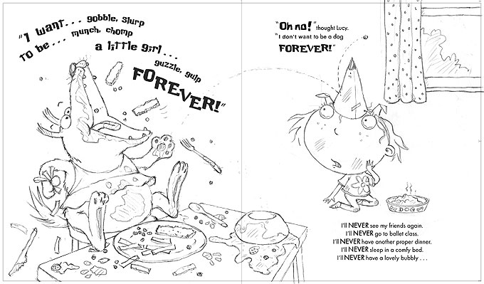
My story is about a little girl, Lucy, and her dog, Sparky. When her alarm goes off, Lucy thinks it's not fair that she has to get up and go to school, while Sparky stays home. Sparky would much rather go to school, as he thinks staying in is boring, so they take the only reasonable course of action... 


...they swap places for the day! Sparky (who I decided should be a slightly fat, mongrel with an over-eager attitude to life), squeezes into Lucy's uniform, while she makes herself a doggy disguise. I had so much fun illustrating Sparky in Lucy's uniform. 


Of course, things don't work out quite as well as they imagine. Lucy starts to find napping at home a bit boring and Sparky creates chaos wherever he goes (although I thought it much funnier if he doesn't realise and just thinks everything is great fun). 

The page above, with the ovals, is Gullane's layout suggestion for part of Lucy's day at home. The shapes don't mean circular illustrations, they just indicate that they'd like one half page image at the top and 3 smaller ones below. 


In my original draft, we just saw Sparky in his regular class, but my editor suggested we could have even more fun with school and has asked me to show a couple of other lessons too. Music presents various comic possibilities I've been exploring:


As you can see above right, Gullane's layouts are suggesting two half-page vignette illustrations: one for the music class and one for maths. I can't say maths is inspiring me, so I'm trying alternatives. Art seems a bit obvious, but 'quiet reading' is looking good.
The opposite side of the same page shows lunchtime. I always knew that would be fun to do. This is from my very first sketch sheet: 


The book doesn't have a proper title yet. It started life as It's Not Fair, which was deemed too negative (fair point), so has had the working title of Dogswap for some time. But that sounds like two people swapping over dogs, so we are still thinking. I've suggested I Want to be a Dog, It's a Dog's Life, The Very Furry little Girl and Dog Day. At the moment my editor is erring towards something simple like Dog Day, but nothing is decided yet.

Wednesday, 28 September 2011

Crocodile on a Trampoline!


On Friday, I finally got the go-ahead for the cover for Baby Can Bounce. 


When I was deciding on the title, I could have chosen any of the featured actions, but I wanted to keep the alliteration that I established with Baby Goes Baaaaa!, which narrowed it down. Ultimately, Baby Can Bounce! is catchy, plus it's a fun, slightly silly action for a cover.

Inside the actual book, the 'Baby can bounce' page features the slug and snake:


Though the idea of a slug on a cover makes me laugh, slug and snake are not desperately cute and might put some people off (especially those with slug or snake phobias!), but one of my fave characters is the baby croc from Baby can dig:


What seems like months ago, Sarah, my designer at Egmont, sent me a basic cover layout, just to get the ball rolling and give me something to design around. That's really handy, as it gives me some idea how much space the title etc is going to need:


I did a few quick sketches of various possible positions for the bouncing baby croc:


I then placed each of the sketches out into Sarah's layout, moving the text around to fit. I thought it would be more fun if all the lettering was uneven, as if it too was bouncing. I sent Sarah back these 3 alternatives:

 
And then I waited....


These decisions can sometimes take forever: designers have to wait for pre-scheduled meetings, where other members of the team, particularly Sales, can give input. 


This week though, they decided on the one at the top of this post, so it's all-systems-go at last. One good idea the Egmont guys have added is the spider - since he appears on every page inside, it's better with him on the front too. 


Right, pastels at the ready... get set... go!