Yes, I am still working on Swap!
Because of all the changes at the publisher's end and the publication date of Swap! therefore being bumped on a year :-( it has been an especially drawn-out process this time. Usually the different stages follow on from one another pretty rapidly, but this time I am having to be very patient.
It's all working well though, despite being a little odd: my original Editor and Designer from Gullane have been allowed to continue working with me, just long enough to see Swap! safely through to proof stage. They have been doing a great job behind the scenes, fine-tuning the book.
I was recently emailed a set of layouts to approve, before we go to the actual printed proof. It is so exciting to see things come together, to see all my illustrations and my text finally fused into one.
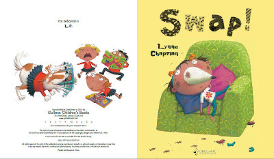
It's looking great. Above you can see the final cover design. Remember all the different design ideas we went through to get it just right? I love that we have been able to use white text for my name, not black, by cleverly reversing out of the turquoise (Paula, my designer was the clever one, not me!).
She has also been using illustrations from within the book to create 'extras' like the title page spread:
I went through the new layouts with a fine tooth comb. There were still lots of little tweaks I wanted to make, both to the text and to the design. It was tiny things on the whole: the odd typo; changing a word here and there, to give a slightly different shade of meaning ('he sighed' instead of 'he said'); or nudging a bit of text over a little, where it cramped the image.
There was one more complex and interesting design problem to solve, but I'll leave that until next time, so I have more space show you the ins and outs of things...


3 comments:
Still super excited for this! Is there a date yet?
Just saw that you replied to my other comment. August 2014?! I guess I'll have to wait a bit longer. It's looking amazing though - especially the cover.
It's great seeing all your work from roughs to finals, inspirational stuff!
Amazing,love the cover and the name in white it's great:)
Post a Comment