Thursday, 30 April 2009

Self Portrait in the Studio


I think I'm finding my feet a little more with this pen & ink lark. I've been looking at Robert Crumb, a fave illustrator of mine for many years, and he has given me the confidence to trust in the quality of the ink line, which I have always thought a little sterile, compared to a nice soft pencil.

self portrait in the studio

So I forced myself not to rush or 'scrub about', but to be methodical, while still trying not to worry too fanatically about being precise. It was as hard on my shoulder as my brain, as my wall-mounted mirror was not in a good place, so I had to support one on my knee the whole time.

I really was wearing a T shirt that colour, and my glasses truly are half pink, half lilac, so I decided to add the splash of colour in Corel Painter, which I think really lifts the drawing. Then I tried a cropped version, adding more colour and toning down the T shirt:

Of course, I have that crazed, axe-murderer stare common to most self portraits: the result of the intense concentration. A look rather enhanced in this case I feel, by the hairdo!

By the way, I've been experimenting with trying to make images larger for you, but it's not quite working right yet, as it makes them less sharp. To view a sharper version of the main self portrait, click on it.

Wednesday, 29 April 2009

Another New Departure...


I'm reading a fascinating book (below), which looks into the sketchbooks of
various artists, who talk about how and why they keep them, what their particular hang-ups are, and any personal 'rules' they impose.


Pretty much everyone agrees it's 'against the rules' to tear a page out, no matter how appalling the sketch. Another common rule is that books must be filled to the last page. Personally, once I get near the end, I worry I'll run out of pages over the day, so take a fresh one out instead. I always start a new book for any new trip too, often finishing only part way through, so I generally have 3 or 4 half-filled ones on the go, which I add to randomly.


Another factor several people mention, is the stifling effect of success: the better you get, the more obsessed you can become with the need for every new drawing to be a thing of great beauty. If you are not careful, this can be crippling.


In recent months, since I've been posting my sketches here and on Urban Sketchers, I have noticed myself starting down that route. Not good!! So, in my new spirit of experimentation, and in an attempt to return to sketches focused less on results, I have set aside my pencil for a while.


Instead, I have bought myself a pen. Ink is a medium I've never used for sketching. This means I am allowed fairly low expectations for a while, which is very liberating. I tried it out over the weekend. The results were rather washed out, so I tinted them with watercolour and waxy pencils. The ink wasn't waterproof, so I sometimes got in a bit of a mess, but had fun playing around, bringing the drawings back from the dead, and was noticeable less uptight about whether it ultimately worked or not.


I am feeling the need to write more alongside the drawings too, another sign I'm feeling less precious.

I have bought some waterproof ink too, so I'll see if that's less messy!

Tuesday, 28 April 2009

Illustration Friday - Theatre


I've not done any Illustration Fridays for a while. I actually did sketch one out for last week (honest guv...) but never got around to colouring it. This week's theme is theatre:

The first images I got in my head were all Shakespearean and a bit trite (Alas, poor Yorick...), so I just went for the theatrical type, doing a run-through. I've always found those coloured theatre spotlights and the odd shadows they create fascinating. I'm sure the colours I've used make no sense at all light-wise, but hey - stop nit-picking!

I'm still experimenting with media and this was done mainly in water-soluble, stabilotone pencils, which are nice and chunky, with a soft, waxy feel, almost like oil pastel. I've had a set knocking around for years, hardly used. I tightened up the rabbit with a line using a graphite stick, which is good and black, and miraculously takes on top of the sticky colour.

On the whole I'm pleased with the image, since it was another foray into pastures new, but I worry it's a bit overworked.

If you want to have a go at the Illustrations Friday topics, click here or here to see my previous submissions.

Monday, 27 April 2009

More Sketchbook Twiddling


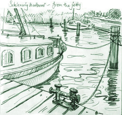
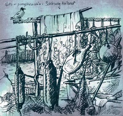
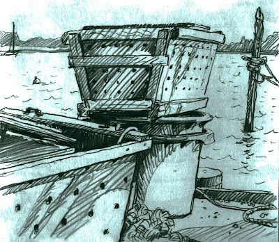
Here, as promised, are some more of my sketchbook drawings from Germany that I've been playing with.

We stayed in a lovely little first floor apartment. This was the view from the window - I love it when you can get above. I really liked the bike against the railing!

On the left is the original pencil sketch. I have tinted it in much the same way as the earlier examples, using a duotone, then exaggerating the paper textures. I like the way the tinted version has the slight suggestion of an etching.

This is the same view, but looking straight down. We were above a bar. Below is the untouched pencil version:

I wanted to add a bit of oomph to this one, as there wasn't much tonal contrast, so I created a coloured paper background behind the duotone line. I exaggerated the paper texture by fiddling with the colour balance.

This last was in Hamburg's botanical gardens, the Blumen und Planten park:

It was a lovely sunny day, so the sketch already has quite dramatic tones and markmaking, so I didn't want to add any texture. However, the pencil work reminded me of some drawings I did back home, onto buff sugar-paper, which worked rather well, so I mocked up the same effect. Here's one of the drawings on the actual sugar-paper:


I have posted more of these, as well as some oil pastel versions of the same view, over on my Picture Gallery.

By the way, that Afrikaans copy of An Itch to Scratch is still up for grabs, if anyone's interested before I advertise it on Freecycle.

Saturday, 25 April 2009

Tinting Drawings


I have a contract to illustrate a new picture book soon, but my publisher is searching for the right text, so I have to wait. I'm using the time to think more about my own project ideas, and have a text going to an acquisitions meeting in a couple of weeks (crossing fingers!). I'll let you know how it goes.

In the meantime, as you'll have noticed, I'm also using the space for some experimental artwork: great fun, as I'm normally too pushed to play.

Last week I scanned in some sketchbook work and have been tinting in Photoshop again. These are all from a trip to Germany, drawn at the harbour in a town called Schleswig Holstein.

At the top is a straight pencil sketch, drawn while sitting on the jetty, below it is a duotone version (in Photoshop, you go to Image, Mode, Duotone and play with colour choices). I'm showing both versions for you to compare, as requested by Granny Grimble!

I love fishermen's nets and floats and stuff, don't you? With the sketch above, I first converted the line to an indigo duotone, then created a textured background layer, lighter in the centre.

I fiddled with the background's Hue and Saturation levels, and added some subtle Filters. You have to alter the light between the layers (Multiply, Hard Light etc) to make the background show through (sorry if you're not a Photoshop person: this'll sound like gobbledygook). I quite like the way the tint adds to the suggestion of the age of the fishing tradition.

This last is a sketch of the eel boxes (sorry, I forget to keep the original scan). I think this probably works the best of the three. What do you think?

The textures here were not created, as with the nets drawing above, but exaggerated versions of what was there, brought out with Levels. As with the Hamburg warehouses, they are reversed, so the slightly grubby smudges round the edges of the page have come out lightest.

I've done a few more, but I'll show you them next time.

Friday, 24 April 2009

Back to Life Drawing


I've not done any life drawing since February, when I did those quickie sketches while teaching, and have not found time to go to any proper sessions since the couple I tried in early January!

So last night I made the effort. The group had to move out of the first place, and is now temporarily meeting in a community centre, about a 30 min walk from me.

I carried all manner of art materials with me, but in the end only used straight forward pencil. Not sure why. You can bet your life if I'd only taken a pencil, I'd have discovered a desperate urge for oil pastels!

Only 4 other people showed up, which was just as well, since the new room was only slightly bigger than a cupboard - I kid you not!! The light wasn't that great either - I really struggle in poor light since I started wearing glasses (I've found I can't sketch in pubs any more).

Having said all that, I thoroughly enjoyed myself and I was pretty happy with the drawings too, given how long I've been away. The sheet at the top was two longer poses, the one on the left is 3 short ones, 5 - 10 mins each.

Thursday, 23 April 2009

Children's Picture Books: Freebies


I have just received this French edition of Giddy the Great (we always get sent a copy of any foreign editions). This one is rather a cute format: a mini size, at just 18 x 16 cm!


I used to collect my foreign editions: there's something rather fun about all those different languages surrounding my pictures. But then I realised it was a waste: books are for reading! So now I give them away instead. It's amazing - I can always find a good home for even the most obscure ones (even Icelandic once...).


Since this is French I know I'll have no trouble, but I also have this Afrikaans edition of An Itch to Scratch (sorry to those I told that it was in Dutch!):

In the past I've used Freecycle to find takers, but I thought it might be fun to try offering them here. So, if you would like either, and are happy to send an SAE, leave me a comment (with an email address).

Tuesday, 21 April 2009

Experimentations


I've been spending too much time glued to the computer, so allowed myself some experimental drawing time today.

I played around with oil pastels this afternoon: in some ways similar to my chalks, but in many ways totally different. One difference is that they melt if you try and work in the garden on a sunny day (note to self!).

I'm not happy enough with the oil pastel bits yet, but I will show you some digital painting I've been trying out tonight. For speed, since I'm interested primarily in style, I thought I'd work with a pre-existing sketch. The cowboy above is from an unpublished project.


I coloured the character first, in Corel Painter. I had no real plan, just playing really. Then I imported him into Photoshop where I warmed the line colour and created a background. I was quite pleased with him in the end and he only took about an hour. Here is how I originally drew him, in pastels:

I'm really pleased that the digital one came out quite different. Dare I ask which you like best??

Monday, 20 April 2009

Making Monkey Magic


I'm feeling a bit sad that I've spent most of today digitally manipulating illustrations from my books on the computer, instead of playing out in the sunshine. Ah well, such is life.

I have been preparing images for the exhibition, for publicity and various 'extra features'.

We are making huge monkey mobiles from the crazy baby monkeys in the above picture, one of my illustrations from Stinky!.

The monkeys were no good as they were, with all the visual clutter in the background. They needed cutting from the picture digitally, and putting on white.


This is slightly trickier than it might be, because they have been drawn in pastels. The pastel texture means you can't just cut round the characters with a straight edge. Which is where the magical world of Photoshop comes to the rescue!

I have a confession: I suspect I'm a bit nerdy with this stuff. I actually quite enjoy the tedious process of doing fiddly jobs on Photoshop.


The monkeys were a particularly awkward task, because of the varied and complicated mass of images going on, around and behind them.

I got it sorted in the end though, and it's even worth missing out on today's sun, because I think you'll agree: they're going to look amazing hanging above everyone's heads!

Postscript: you can now see photos of the exhibition in action and read about the launch, or hear about my dinosaur day amongst the exhibits!

Friday, 17 April 2009

Website Redesign


Do you remember AGES ago I said I was thinking about paying someone to update my website? It's taken a while to pin down what I need, and what's possible, but I believe we are just about ready to go.

I had a meeting this morning with Diego, who is going to tackle the job. His office is nearby, so we've already met a couple of times, talking through possibilities. The site's a bit of a beast: I originally built it myself, nearly 10 years ago now, and have been slowly adding to it along the way. It doesn't look too bad, considering, but the systems I've used are antiquated now, so it's a nightmare to keep updated.

Enter Diego! We have devised a plan of action and he is making a start next week. Superficially, the homepage will look much the same, but some pages will look quite different I think and it should work a lot better.

In the meantime, be patient with the poor old website. Diego is going to try and keep it functional as far as possible, but there may be some anomalies, and of course, I won't be adding anything new now until it's finished.

And if there's anything you want to see that isn't there, now's the time to say...

Thursday, 16 April 2009

Exhibition Meeting


Remember I was trawling through all my artwork
last week? Well, Marie Knudson & Katie Kennedy from Tameside Art Galleries visited the studio again on Wednesday morning, to help me shape-up plans for the show. We went through everything I'd shortlisted and have now got a final selection.


They were both as excited as me (isn't that great?) which meant we just couldn't whittle it down as low as we'd planned. So... they are letting me squeeze even more images in - hurrah!! We are going to frame 24 double-page spread illustrations as the main show, plus another 12 smaller pieces, mounted lower on the walls, at child's height. All the above titles will appear.


In the centre of the space, we are still going to build a little ark, with working hatches, and make soft toys based on the animals, for kids to pop inside. I am also going to try and put together a whole section using Lark in the Ark to explain how a flap book is created, as it's quite complicated and interesting.


There will be a quiet reading area, themed around Smudge and Stripe's living room above. Marie is actually going to build a mock-up room, with the stripy sofa and the fireplace and even decorate the walls with props on foam board, like the clock and the vase of daffodils!


Instead of just a magnetic Stinky warthog, we've decided to make a huge print of this spread, onto thin metal, with magnetic flies and various toys for kids to add into the picture. And Marie is thinking it might be rather fun to make a vinyl game mat, recreating the Jungle game from this spread:

My job now is to trawl through all my digital artwork, so the team have all the images they need to make the various creations, then start writing copy for picture labels, wall features and info sheets. Plus I need to contact all the authors and publishers involved, to let them know our intentions. I imagine they'll be delighted, but it's polite to make sure!

Wednesday, 15 April 2009

Blast From the Past


My 'after the holidays' return to work started really nicely, with a visit from someone I've not seen in years. I taught Phil Alderson when he was a student at the Sheffield College. I stopped teaching about 12 years ago, so we're going back some!


I loved Phil's work even then, and have been keeping an eye on what he's been up to. He has illustrated all sorts of projects, including designing educational e-games and selling his work as prints. He also has two published children's novelty books:


He would like to get into more mainstream picture books (publishers take note!) and wanted feedback on new portfolio work, which is how he came to be visiting the studio yesterday. He also brought the exciting news that he is to be a father, literally any day, so congratulations Phil and Helen!!


By the way, if you are the proud owner of nippers of your own, Phil will shortly be selling ABC posters featuring these and many other funny characters on his website.

Tuesday, 14 April 2009

Playing With Sketches


Since the sun decided to come out yesterday, I spent some time gardening - the first time I've set foot out the back this year. Yikes! I weeded and pruned my socks off for a good few hours, then reckoned I'd earned a bit of play time.


I found a sketchbook from when John and I had a week in Hamburg. I scanned in a couple of drawings of some wonderful old warehouses we found looming above the river Elbe, then played around in Photoshop with colours. None of the colour was in the originals - they were simple 3B pencils sketches.


The textures are not imposed, just exaggerated - they come from the paper itself, and from the drawings being a bit thumbed and smudged around the edges. The tonal values in the background are in fact reversed - what was grubby is now whiter, the cleanest whitest paper is the orange.

Monday, 13 April 2009

A Review and a Bedtime Story


Just a quickie - I opened my email this morning to find a couple of really nice messages, with interesting links about my books that I wanted to share with you:

The first is a lovely review by the Falcata Times of my newest title, Gnash, Gnaw, Dinosaur!, due out in about 6 weeks. Thanks Gareth! It's so hard these days to get bookshops to stock the books, reviews are worth their weight in gold, otherwise people simple don't know they're there.

Another, even more fun link, has been sent through to me by fellow illustrator, An Vrombaut (who you probably know from 64 Zoo Lane). She spotted that Kangaroo's Cancan Cafe was read as the Cbeebies Bedtime Story a couple of days ago. Thanks for letting me know An!

Sunday, 12 April 2009

Children's Book Artwork: Mice, Pirates and Hens in Space


I've been going through all my picture book artwork, trying to select pieces for this summer's exhibition in Tameside. The curator is coming to the studio on Wednesday to help me choose likely pieces, so I thought I'd better get my head round things, sharpish like!


It's proving hard work: there's so much stuff to go through. I'm only considering UK books, but with anything between 15 and 30 drawings each, that's still tons. I thought maybe I'd leave out the older titles, but then I do have a soft spot for poor Grumpy Smudge (above) and Big Bad Wolf:


I store all my artwork wrapped into A1 clear plastic envelopes, a book at a time. Much of it was archived in the eaves, which meant scrawming into very awkward places, and dragging it out (as you can imagine, it's a bit heavy). I needed a cup of tea and a sit down before I had even opened the first package!

Being pastel, my work occasionally gets smudged during the scanning process, Class Three all at Sea was one that suffered badly, partly because of all the black and white chalk involved, so though it's good fun, I will eliminate that.


Books with flaps are often difficult to frame up, because the artwork doesn't make a lot of sense. You have to draw what the page looks like without the flap, so you get strange anomalies in the middle of the illustration, like the page above from Lark in the Ark where the animals will eventually be covered by two spotty duvet flaps.

Both When You're Not Looking! (above) and An ABC of Nursery Rhymes (below) feature all cut-aways (ie illustrations without backgrounds) which makes the original artwork less appealing, because of my pink paper. So they're out of the running too.


I've also got to bear in mind the potential for children's workshops and interactivity linked to the work. Oh dear, oh dear...

I'll let you know what I decide.