 I have a contract to illustrate a new picture book soon, but my publisher is searching for the right text, so I have to wait. I'm using the time to think more about my own project ideas, and have a text going to an acquisitions meeting in a couple of weeks (crossing fingers!). I'll let you know how it goes.
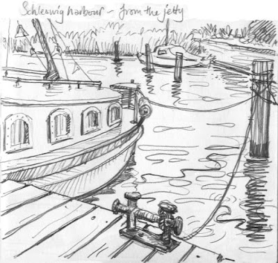
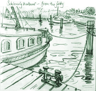
Last week I scanned in some sketchbook work and have been tinting in Photoshop again. These are all from a trip to Germany, drawn at the harbour in a town called Schleswig Holstein. At the top is a straight pencil sketch, drawn while sitting on the jetty, below it is a duotone version (in Photoshop, you go to Image, Mode, Duotone and play with colour choices). I'm showing both versions for you to compare, as requested by Granny Grimble!
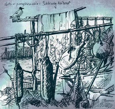
I love fishermen's nets and floats and stuff, don't you? With the sketch above, I first converted the line to an indigo duotone, then created a textured background layer, lighter in the centre.

I fiddled with the background's Hue and Saturation levels, and added some subtle Filters. You have to alter the light between the layers (Multiply, Hard Light etc) to make the background show through (sorry if you're not a Photoshop person: this'll sound like gobbledygook). I quite like the way the tint adds to the suggestion of the age of the fishing tradition.
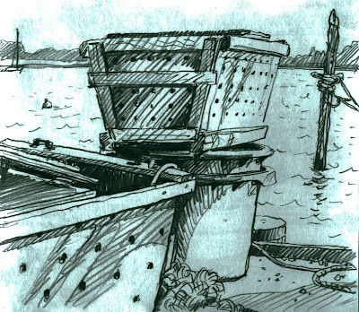
This last is a sketch of the eel boxes (sorry, I forget to keep the original scan). I think this probably works the best of the three. What do you think?

The textures here were not created, as with the nets drawing above, but exaggerated versions of what was there, brought out with Levels. As with the Hamburg warehouses, they are reversed, so the slightly grubby smudges round the edges of the page have come out lightest.
5 comments:
I have a text you might be interested in illustrating. It's right up your street. Aimed at 3-5 year olds and set in a zoo. Sounds right up your street!
Thank you for the 'before and after' drawings. It makes it so much more intresting. I don't mean that it wasn't intresting before! I really like this new technique that you are developing. If I can get my head round it, I may have a play around myself!
Thanks Claud, sounds great, but you need to send it to the publishers first - I have no sway I'm afraid. The publisher I referred to is Gullane.
Thanks G.G. - more on their way later today!
Yep! I think the second two are particularly successful.
I'm not a photoshop person, so this all seems somewhat like magic to me--but I love the results.
Post a Comment