Last week, the scans of my Jungle Grumble illustrations came back from the repro-house. Things have been a bit fast and furious: I've had just a few days to get all the 'finishing work' done, then Dropbox the final digital artwork back to the publisher, ready for everything to be put together and sent off to the printer. Phew.

There were three 'finishing' jobs for me to do in Photoshop / Painter:
1 - text overlays
Children's illustrators never draw text onto their actual artwork, because of translations. All text, even wording that is part of the actual picture, is added afterwards, digitally. Unfortunately, because of the pastel texture of my work, ordinary, typed text 'floats', so I make my own text overlays, using Painter, which look like they are drawn in black pastel. Luckily there wasn't much intrinsic text in Jungle Grumble, only one lion roar and the Swap Shop sign, though that does appear a few times:

2 - legibility issues
To keep things as clear as possible, it's easiest when a story's main text falls over areas of sky. That wasn't always possible in Jungle Grumble: in several places I had to use trees or bushes as backgrounds for text. But it was tricky to be sure precisely where specific lines of text would need to sit and, because of my style, it was hard not to include undergrowth textures which might be visually distracting behind the words. Once my designer got the scans, she was able to layer the two together so we could spot any places where things were slightly too busy or too dark to be sure of maximum visibility. I then used Photoshop to make subtle changes. Spot the differences to the bush bottom right:


3 - vignettes
Not all my illustrations are full spreads with illustrated backgrounds. Some pages feature smaller vignettes: characters against a plain background. My biggest digital job is cutting vignette characters off my pink paper. It takes ages because of the pastel edge, especially where the pastel colour is close to the pink of the paper, like Lion's roar:
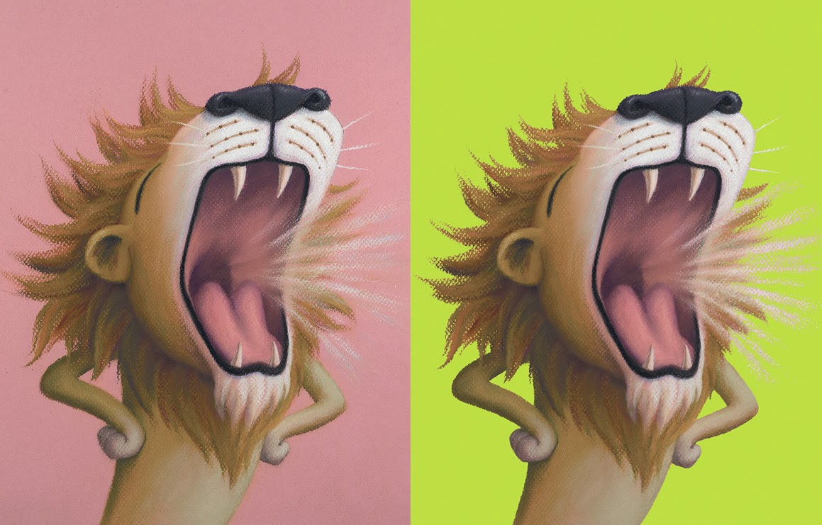
He looks so much better on green, don't you think? For anyone who wants to know how I do the cutting out, here's a detailed 'masterclass' (though my version of Photoshop is old, so many things may be slightly different on up-to-date editions).
Most illustrators don't do this digital stuff themselves, but I prefer to, as the pastels make it quite a bit more tricky than usual. It's possible that I'm being a bit of a control freak, as usual, but after all that time spent getting the drawings done, I like to be sure that these final alterations are exactly right.
Most illustrators don't do this digital stuff themselves, but I prefer to, as the pastels make it quite a bit more tricky than usual. It's possible that I'm being a bit of a control freak, as usual, but after all that time spent getting the drawings done, I like to be sure that these final alterations are exactly right.
7 comments:
Really nice to see what you did with the text...it does look like actual handwriting.
Oh, I read your post about your Sailor pen and have gone ahead and bought one myself. Just getting used to the angles I need to hold it at but so far, like yourself, I am impressed with what it can do. Thank you for mentioning this pen in a post recently, as I would never have considered such a quirky little pen for sketching....ann
I was looking at this lovely bright green background behind your Lion, and was wondering... How do you select colours that will fit within the printing gamut? Do you work in a CMYK colour space when changing your pink paper colour? Do you set up Photoshop with any profiles for the printer, or do you just use gamut-safe colourways?
I find the whole print ready files thing a bit confusing when colours on the screen might not be printable.
Thanks for any insight you may have.
Glad you like it :-)
I just make sure I am working in cmyk. Then all my colours are printable.
Another fab post Lynne, keep them coming and good luck! :-D
You guys ,
So funny and
I appreciate your post .
Good job again. Appreciate the book cover illustration
Post a Comment