On Monday morning, despite the sunshine in the garden, I knuckled down and started the digital stage of Baby Goes Baaaaa!. Come Tuesday, I had to break off for my assessing work at the University, but today I have been hard at it again.

Each of my pastel illustrations for the book was created on my usual, pink paper but, as you can see from the mock-up above, created by Sarah, my designer at Egmont, the images are designed to sit on bright background colours, so the pink area around each drawing needs removing.
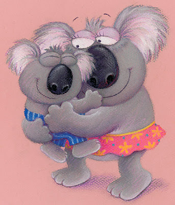
I won't go into the boring details (yawn...) of how this is actually done in Photoshop (I can already hear your sighs of relief), but since I always have to do this bit, I thought I'd quickly explain the principle again, using the koalas as an example.
I get back a scan of each illustration that looks like the one above. In good old Photoshop, I then quickly knock out the pink, to get this instead:

This might look done, but the final image is going to sit on the pale yellow, so I create a temporary yellow layer beneath my koalas, so I can guage exactly what it's going to look like.
The first, obvious thing to adjust is the shadow.

The lilac shadow above looked right on the pink background I began with, but is way too strong on yellow, so this looks much more natural:

I will go back and soften the dark line beneath his feet I think, but otherwise that's now fine.
I next need to fine-tune the edges. This is more of a problem on some illustrations than others. The koalas are not too bad, as their grey fur colour is fairly different to the pink I cut away, so it's worked pretty well. It can still be touched up slightly though. Look at a section near the bottom:

It's subtle, and I'm careful to keep the irregular pastel edge intact, but you can see the one above is just a little ragged compared to my fine-tuned version below:

If you look at the back of the skirt and the area between the legs, you can see I've also taken the opportunity to get rid of the occasional bit of pencil line, left over from tracing up.
This is how the finished piece looks:

Once they are all done, I will look at all the illustrations together and decide whether I think Sarah's colour choices need any adjustments, or whether I am happy to go ahead.
14 comments:
Great post, it's interesting to know how you go about removing the background surface colour to drop in a new one.
Isn't it wonderful when you see your characters with new colours behind them! They look slightly removed from your artwork, and begin to take on their role in the book.
Will it be a flat digital background colour, or will there be a little texture added to match the surface in the pastel work?
Thanks June. Yes, it will be flat colour: the contrast helps to really throw the images off the page.
Actually, Lynne, I'd love to have more of those boring details! Such as do you have an exceptionally good scanner? And is the image you manipulate in Photoshop the very one that will be printed? Back when I tried these things (about a decade ago) I was told that image quality wouldn't be good enough with household scanners of the time.
Very interesting! I love seeing other peopl's process. Any chance you've done a post in the past discussing how you photoshop out the background? I'm guessing it's a bit mroe involved than using the magic wand tool since you have pinsk showing through in all kind sof areas due to the rough texture of the pastel.I'v edoen alot of work with this sort of photoshopping bu tallways interested to learn better techniques.
Hi TT: yes, I do have an OK scanner: an Epson GT15000 (went A3 a couple of years back, which is wonderful) but all my scans are done professionally - still better quality than home and colour balanced ready for printing in the same repro house.
Yes Matthew, I have done previous posts and I do remember one that went into a fair bit of detail, but it was a while back. If you use the labels on the right, you should find them though.
I'll do a post with a bit more detail for you both in a bit and put a link on to earlier ones too.
Gotta get back to those scans just at the moment - under strict instructions from Egmont to get the head down!!
Hi Lynn,
Thank you for your wonderful posts. I think you are an amazingly generous artist in sharing so much of your technique. I love reading your blog. I look forward to every update.
Hi Lynn,
Thank you for your wonderful posts. I think you are an amazingly generous artist in sharing so much of your technique. I love reading your blog. I look forward to every update.
What a lovely comment - thank you!
Photoshop's great isn't it? I have no idea how much longer everything must have taken before its invention. And you certainly have cut outs down to a fine art!
Ah yes: the days of white-out & scalpels, of typewriters & tippex, and of taking roughs to the Post Office for the old lady behind the counter to try and enlarge them for you on their photocopier... How did we manage?
This book character kids loved him and also this book story amazing thanks for share it writing a literature review .
Exceptional looking and better for childrens .
Those background is creation are creative .
I am loving these children illustrations. You are really really so creative. Thanks a lot for sharing with us.
Raster To vector/clipping path service
Post a Comment