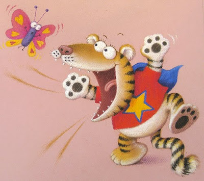
I need to get all the artwork for Baby Goes Baaaa! done by the end of this week. When you last looked in on me, I'd done the ducks and monkeys and had almost finished this baby tiger (who, as you can see, now has his stripes). All that was left was the cover and the Nana Crocodile illustration.
I got the go-ahead on the cover re-design last week and, apart from my sneaky day off, have been working away on the artwork. As there are several characters on the cover that I've already designed for the inside of the book, I needed to tack all that previous artwork to my desk, for colour reference:
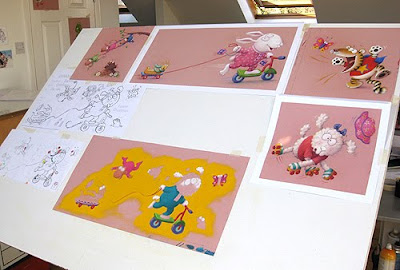 I'd previously sent all the artwork I'd done so far to the publisher, so they could present the project at Bologna, but they had to post it all back to me for this part.
With the inside illustrations, I've not worried about the background colours and will try things out later, in Photoshop. With the cover though, I wanted to design it with a background colour in mind: it's so important, as it can completely change the book's appeal. After much thought, I decided to go for golden yellow, keeping all the outfits and toys as bold, strong colours, to stand out against it.
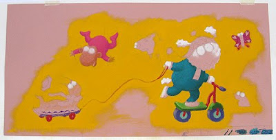 As the yellow will be dropped in digitally, I didn't intend to colour it in like this but, without it, I soon began having trouble judging the effect of the other colours. So I stopped and, very carefully, coloured around what I'd already done in the golden yellow pastel, as above.
Then I carried on. Except, the yellow was very messy and kept getting all over my hand and smudging. So I stopped again, to spray it with fixative before continuing. And this is why I HATE fixative! Just look at the effect it has on the colours:
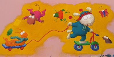
The patch of lighter yellow is the original colour, drawn back over the top to show you, the rest is considerably darker. So my next job was to go back over all the yellow, even more carefully than before!
By the way, the more eagle-eyed amongst you might have noticed the new addition of the frog. We will probably only see his head, peering round the edge of the title, but I'll explain why he's there next time.
3 comments:
Illustrating is one of the best designing software .
Amazing to see those .
Thanks for sharing this blog it's very informative
Post a Comment