I have redesigned my children's book website! Well, when I say 'I'...
I've had the website lynnechapman.co.uk for over 15 years, the very first version of which I did create myself. It was redone and much improved in 2009, but then last year, I got someone to help me create a brand new urban sketching website, because my work has shifted in recent times: these days, I make my living more from my reportage work than from my children's books.
My web-designer also took a look at my faithful old illustration website, which I thought was fine. Wrong! He explained that it urgently needed upgrading, because the behind-the-scenes stuff was no longer working so well. The main problem was that the world has changed since 2009. My site didn't have any facility to cope with people looking on mobiles or tablets: modern websites resize themselves and do all sorts of clever automated stuff to make them more usable on small screens.
The whole website had to be dismantled and rebuilt, bit by bit. I took the opportunity to update the content of course, adding new photos everywhere, with my up-to-date hair, instead of the old spiky look:
We totally redesigned the homepage, as you can see at the top, and I now have a completely new 'Availability' calendar, which is much easier to use and read:
I also slimmed the whole site down a little. It is now a leaner, fitter beastie! I've added a few newish bits too. There's a Hot Tips section, to take people to a few key posts from my blog (the content was there before, but a bit buried):
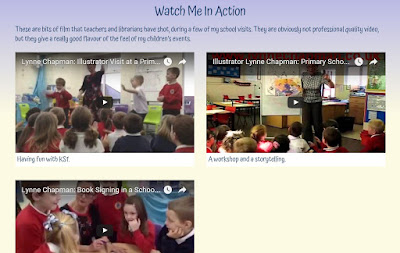
Plus videos taken of me in action by teachers and librarians, which have always been on my YouTube channel, but I figure it's good to have them up-front, for schools to see.
Take a look and see what you think. I'll be interested to hear of anything which doesn't work properly or doesn't look as good as it should on certain devices. I have been through it with a fine toothcomb and it all looks good on my computer and mobile now. But any anomalies, let me know.


8 comments:
And I thought getting old juat involved bi-focals and "special" train tickets...sigh.
I'll pop back later and have pee-rooze..
So far, so good.
Your talent and enthusiasm is inspiring.
Cheers! That's lovely.
So pleased for you and looking forward to looking through. Your zest and diligence and joy are inspiring as always
Thank you Suzanne. How nice!
It's amazing how far technology has come in the past 8 years. The need for websites to have the ability for viewing on mobile devices is definitely a necessity! The improvements made to your website make it easier to navigate and view. I'd say it makes the content seem more interesting.
Now that is a sharp-looking website. Much more updated and more sleek than the "old" version. Was it frustrating while it was being rebuilt or was it a fairly smooth process? Can't wait to check out the content in more detail but for now, the surface level looks amazing!
Thank you. So glad you like it!
No, it was fairly smooth since I wasn't doing the programming bit, just the superficial design. It was only frustrating in that it took ages to rewrite all the updated information, decide what new features to do and what old things to lose and to gather new more up to date photos for everything.
Post a Comment