I thought it might be interesting to use my work on Jungle Grumble to talk about how I design around text. One common error made by would-be children's book illustrators, is forgetting that quite a lot of space needs to be created in your illustration for the words.
This can be a challenge if the illustrations need to be busy. Though ideally the text is evenly spread through the book, this is not always possible, depending on the action. Some spreads can end up very 'text-heavy'. Others have lots of dialogue and all those new lines make the text expand down the page:
Before I put pencil to paper, I always ask my publishers to set the book's text in the chosen font, at actual size, so I know exactly how much space is needed. I then create blank templates for each spread in Photoshop (as above, with the gutter clearly marked), into which I place the text.
Obviously, until I have drawn the illustrations, nobody knows where the text needs to be positioned, so I am okay to move it around, as long as I follow basic design rules (like keeping an appropriate distance from the top / edges / gutter).
Mostly I keep the specified text on the particular spreads suggested by the publisher although, with Jungle Grumble, I did make a couple of changes. For instance, in my brief, this text at the very beginning of the story was split across 2 spreads:
Which seemed an unnecessarily slow start and, by combining both sets of text into one illustration, I freed up an extra spread for later in the book, which was very handy when we were in the thick of the action.
While doing the first thumbnails, I estimated the text area needed:
I then enlarged all the thumbnails and popped each into one of my Photoshop spread-templates. Dragging the bits of text into the positions my illustration idea demanded, I was able to see where more space was needed and rearrange the compositional elements accordingly.
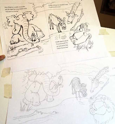
Below is the spread that fits the template at the top of this post. You can see how I have divided the block of text into 3 sections, to make it more palatable to the reader and also easier to draw around. I have then placed the proper text in position on the enlarged thumbnail, replacing my estimated, hand-drawn text. This one fitted the actual text really well:
Using layout paper over the thumbnail print-out (which is translucent, allowing me to see enough of the thumbnail to guide me, but not too much, so no visual distraction as I redraw), I reworked the illustration, making sure I didn't get too close to the text.
My new drawing was re-united with the text when it was scanned and placed back into the Photoshop template, in place of the thumbnail:
Of course, the designer will now rework the text layout - mine is just a suggestion for how I think it best fits my illustrations. Sometimes it stays as is, other times they have ideas to make it funkier.


5 comments:
That's really interesting to see from a writer's point of view! Thank you, Lynne.
I've also been editing picture books recently, and it's surprising how some authors don't seem to think about how much space their text might take up on the page and how that might squeeze the pictures. I cut wherever I can. Cut, cut, cut. The fewer word the better!
Thanks for posting:)Very usefull:)There is always something to learn here:)
very nice blog. Thank you for sharing your fantastic art
-Kat-
Great information!!! I was surprised to learn the publishers allow you to manipulate the text as much as they do. It makes sense, though. How else could one create final illustrations without the text layout? Thanks for such valuable information! Love your blog!
I read this article and its give me good idea and also tell us how to cover your book mistake after writing a book and how to main-tan his lesson with easy way thanks for share it social work personal statement examples .
Post a Comment