Friday, 30 August 2013

Blue Bottoms and Funny Faces


It sometimes makes me laugh: as an illustrator you catch yourself having very serious conversations about the funniest subjects. This time it was blue bottoms. Julia Jarman wrote a Blue-Bottomed Baboon into The Jungle Grumble. He of course wants to swap his bum for something different (he ends up with Zebra's stripy tail in its place, but that's by the by).

The thing is, when I did my photo-search for reference, not one single photo of a baboon's blue bum came up. There were plenty of the disturbingly swollen, red ones, which look like they've been inflated (built-in cushion?), but no blue ones. However, a photo of a mandrill's blue bottom did appear. I hadn't heard of a mandrill: it's a bit baboony, but with a face like an explosion at a cosmetics counter.

A bit more research told me that there was no such thing as a blue bottomed baboon. So I emailed my publisher, who emailed Julia, who texted me. According to Wikipedia, the mandrill is often referred to as a baboon, so we thought we could get away with me drawing the mandrill instead. That suited me, as mandrills look so bonkers. Also, to be honest, I don't especially like drawing baboons: their faces are hard to get right (I drew baboons-in-pantaloons in Lark in the Ark). 

That's when I did this sketch of a mandrill's head (on a giraffe's neck, naturally).

The only snag is that mandrills don't have monkey tails - they have short, rough tails, more like a goat. I thought that might be a little bit confusing in the final illustrations, especially given that our mandrill would have to give his tail to someone else when he swapped his bum. 

More emails...

I was just discussing the ethics of sticking a baboon's tail onto a mandrill, when my editor found another blue-bottomed monkey. 

The lesula monkey was only discovered in 2007. It has a perfect monkey tail and a slightly less obscene-looking bottom than the mandrill (if you ignore the rather prominent, blue dangly bits - I won't be drawing them):


So we decided to change again and use the lesula monkey. Since nobody will have heard of a lesula, we are going to just call him Monkey. This was my first sketch of him:


His face is equally as funny as the mandrill's, just in a different way - sort of weird, with hauntingly human eyes and a puff-ball head:


After a few more drawings to better develop his character, this is what I think he is going to look like in the book:


Tuesday, 27 August 2013

New Demonstration Films: How to Draw Bears

John has now finished editing together the films we shot recently. There are five new films altogether. 

The ones that are entirely new are three demonstrations, showing how to draw the bears from Bears on the Stairs. I take them one at a time, sketching them in pencil and talking you through what I am doing and why, as I go along. First I tackle the Big Bear, and draw him sliding down the banisters:


Then I do the small-but-growly Little Bear, pulling a rude face:


In the third film I draw the fat koala, picking his nose:


The other two films we've uploaded are remakes of the How to Draw a Cat film we made some time ago. We were never very happy with the fact that some of the initial sketching is not very visible. In hindsight, I also felt that the introduction, though full of interesting information, might be a bit annoying if all you wanted was a drawing lesson. 

So, as part of the revamp, we have split it into two films. Part 1 is me talking to camera about the various cat characters I have created for my books and how I use reference to create the poses, a lot of which has been re-shot, providing close-ups of my illustrations as I talk:


Part 2, the drawing demo, we did from scratch. But because I didn't want to just repeat what I had done before, I chose a different illustration to draw. It's the same kitten as before, but this time I talk you through created the illustration from Baby Can Bounce, where she is sharing an ice-cream with a little spider friend:


If you have the time, do please take a look at them and let me know what you think. I would also be interesting to hear if you have any thoughts about films you would like to see. Oh, and please don't forget to 'share' the links if you like them, so more people get to see them.

Thanks!


Sunday, 25 August 2013

Characterisation - Turning Real Animals into Picture Book Characters


There are 10 different animals featured in The Jungle Grumble. I collected lots of photo reference via Google Images (how did we survive before?) to help me sketch the animals into my 'thumbnail' roughs. Of course they were only titchy, as each thumbnail spread, like the one below, is only about 2 inches high. 


I was drawing much larger versions of each animal when I was designing the crazy combos, but at that stage I wasn't fretting too much about characterisation, just visualising how the 'bits' might fit together: 


All this has proved a great way to loosen up. Usually, I start work on a new book with the characterisation, which is by no means the easiest part. This means that I generally have a day or two of agony and extreme grumpiness, before I warm up (John gives me a very wide berth!) 

This time, having planned all my spreads in miniature, I then went back to sort out the characterisation. Because the swapping will make the illustrations quite complex and tricky to 'read', I don't want to dress the animals (usually a good way to help establish character), or even to accessorise them, as I did in An Itch to Scratch where the animals were unclothed. 

Which means that it all has to be done through face and body language. You can see from the sketches here, that I draw the face of the creature again and again, trying different things out:


The idea is to use the photo reference to get basic shapes and key features that make an animal look, well... like itself. Then I play around with nose shapes, eye height etc, creating variations on the theme. Each time you alter a feature, you get a different, unique individual, which suggests a different personality. Some look more male, some female. Some are more successful, others not. Generally speaking, they get stronger with each drawing.


This is a very important part of the illustration process: the reader has to believe in each animal, not just as any old giraffe, but as a specific giraffe. I get the personality started in my sketch then, if it is 'alive', the reader will enlarge on this in their imagination.

Friday, 23 August 2013

Barcelona - Sketching in the Boqueria


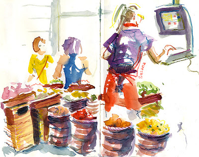
OK, I promise, this is the last post about Barcelona! It seems ages ago now, but I just wanted to show you the sketches I did in the market, as I was really pleased with them.
  

I didn't get the chance to do much exploring during the actual symposium, what with teaching until lunchtime every day, then trying to squeeze every drop from the rest of the workshop, demo and lecture time. But as soon as it was all over and I had my free days, I was desperate to get into the Boqueria to have a go, as I had such fun last year, drawing in the Santo Domingo market.


We were given lots of freebies from the symposium's sponsors (which was lovely!), including a Japanese concertina-format Moleskin. I already have one on a shelf in my studio (a Christmas present which I still haven't used, because it's a bit intimidating), but I decided to take the bull by the horns and get stuck into this one, while I was inspired.


It was perfect for the subject - I unfolded 3 pages at a time and worked my way along the paper, doing studies of the various kinds of stalls, letting them run into one another, so it all linked up, just like the market itself.


Once or twice I lost control and the whole lot unfurled itself all over the place (once it goes, it's like a slinky and there's no stopping it), but a couple of sturdy clips sorted that out. While I was drawing the stall below, the butcher opposite brought out some crates and quietly set me up an ad hoc table.


If you are an observer of detail, you might have noticed that I am re-trying the people-catching technique we were shown by Inma Serrano: using watercolour shapes to capture the basic poses, then watercolour pencils for adding small amounts of linear detail, leaving as much to the imagination as possible.


One issue with watercolour is drying time. I hate having to wait, especially when I am in that kind of environment and am trying to squeeze as much drawing in as I can, so I always carry 2 sketchbooks, that way I'm not tempted to ruin a painting by turning the page too soon. That's why a couple of paintings are not part of the panorama at the bottom.


I worked most of the day, painting right through lunch (there's dedication indeed!), then went back again on my final morning for another quick blast before my flight. 


It can be a bit intimidating, because of all the people milling about but, if you can find a corner to tuck yourself into (I often found myself cosied up to the bins), markets are a fabulous way of capturing life in all it's colourful, bustling glory. Here's how the sections joined up:


Thank you to Moleskin for this lovely, Japanese book. I've had a look on their website and, as far as I can see, you can't normally get a watercolour paper in this format - it was specially made for the symposium. Thanks too to Stillman and Birn for the book I used through much of the symposium and for the rest of these sketches. It proved to be a good all-round book, good quality paper at a practical size and weight.  

Wednesday, 21 August 2013

Planning the Layouts with Thumbnails


I am still beavering away on Jungle Grumble from my makeshift, armchair workstation. It's not too bad at all. I have most things at my fingertips and the laptop to use for reference photos for the various animals. No scanner though, which is why the images here are not quite as crisp as usual - sorry about that.


Having worked out how the animals all change, I now have to plan the pencil illustrations for the whole book. I have been trying some layout ideas in these little thumbnail sketches. 

I don't normally work with thumbnails - I prefer to draw full size from the start (so much of the humour in my work derives from facial expressions and subtle body language). However, big drawings take longer, especially if I need to visualise several different versions before I get it right, and I am slightly concerned about the deadline for this project. I have to get all the roughs, plus a couple of pastel spreads done by the end of September, ready for the publisher to take the project to the Frankfurt Book Fair, where they will be looking for co-edition interest. 


I have a few other commitments in there too, plus it's a rather complex book, with a cast of 10 main characters, plus sundry others, all of whom are different creatures, so need characterising individually.


Anyway, that's why I am working smaller and, I have to say, I have found it quite OK, as long as I also do occasional larger drawings alongside. 

I feel as though I am getting used to the animals as I am going along too so, hopefully, when I start drawing them a bit bigger next week, they will have already adopted many of their individual characteristics.

Wish me luck!

Monday, 19 August 2013

A Bit More Filming


Because we knew I was about to be very busy again with my new book, this time last week, John and I decided to spend a day doing a bit more filming. It's been 2 months since we made the last one, the How to Draw with Watercolour Pencils demo (which I'm proud to say has already had well over 6000 hits - thanks to those who helped with that!).

Anyway, we wanted to keep the momentum going. With my foot problems, we had to stay in the studio, so we shot more of me demonstrating how I created various characters from my books. 


We began by re-shooting bits of the earliest film: Drawing a Cat, because it was too difficult to see parts of it, especially the initial stages of me demonstrating (we hadn't bought our fancy lights at that point). I decided to demo something slightly different though this time round, to make it a new film too, so instead of the singing kitten from the first film, from Baby Goes Baaaaa! I drew the kitten from Baby Can Bounce!, sharing an ice-cream with a cute spider:


It takes AGES. I really understand now why film sets are so boring! It's mostly about getting the lighting set up. It's amazing how incredibly dark a very bright room can look, plus there are all sorts of issues with me getting silhouetted against windows, reflections off the books, or sunlight going in and out. We generally have to have the blinds down and then re-light the room artificially, to keep it constant.

Then there's noise. All phones have to be disabled to stop someone calling in the middle of the shot; the computer has to be completely off (too much fan-noise); all windows have to be closed (even when we are frying under the lights!) in case of background noise... it's a right performance. Would you believe it, we had just got set up when a neighbour had a contractor round to pump out their drains - it held up play for over an hour!

The final spanner-in-the-works is me. I like to do my talking off-the-cuff, so it sounds as fresh and natural as possible. That means it often needs a fair few takes before I stop fluffing it, or saying something that sounds completely idiotic.

It was funny: above the desk in the photo at the top, everything looks pretty normal but, down below, we had to lash my bad foot to the cross-beam of the drawing desk with one of John's belts, because I still had to keep it elevated. It is even packed in ice, wrapped in the tea-towel:


As well as the kitten demo, we also shot films of me drawing all three bears from Bears on the Stairs: 


John is working on the editing now, why I am getting on with The Jungle Grumble. I will of course let you know when they are ready for viewing. In the meantime, you can see all our films to date on my YouTube channel.

Friday, 16 August 2013

Barcelona Symposium - Sketches That Sing


I want to pop back to the Urban Sketchers Symposium today...

As you know, I was honoured to be chosen as an instructor again this year. I called my workshop Sketches That Sing, because I wanted to help people to find techniques for freeing up their work. I thought some of you people out there might also find it useful, so I am sharing the principles here.


It's so easy to get caught up with trying to replicate the subject we are drawing and to forget that, once you have walked away, nobody will care about that aspect: they will judge your sketch on how interesting, exciting and dynamic it is. What's more, they won't have the original there to compare. Once you take that on board and allow yourself to let go a little, you can create sketches that sing their own song, independent of the thing you are actually drawing.

Since I don't know Barcelona, the symposium organisers allocated me a little square to work in, just 5 minutes walk from the CCCB centre where the conference was based (perfect, since I am inclined to get lost). Each morning at 10am I led my little group over there, to brief in the workshop. 


I had a translator for the Spanish speakers, Helena Xicola, above. I've never worked with one before. Helena did a grand job keeping up with my motor-mouth. She was a great help in lots of ways: by the third session, she knew what I was doing as well as I did and was brilliant at helping to explain things to people (thank you Helena!).

Anyway, for those who want to try it at home, here's what we did. I broke the 3 hour session into 3 exercises, each designed to get people to think about a specific technique they might use to force themselves to let go of a little part of reality. 


The first was framing. I often crop my subjects very close, like the sketch above. This can add considerable dynamism to the page. I asked my group to consider the 4 edges of their book as part of the sketch. 


Each person selected a specific object to focus on and I challenged them to draw so that their object bled off at least 2 of their page edges, like this portrait by Beliza Mendes from Luxembourg and the bike below, done by Santi Salles from Barcelona itself. 


We looked at the negative spaces created, at the beauty or ugliness of the shapes you can make and how tilting your perspective can help you avoid boring, horizontal cuts across your page.


The next exercise looked at colour, because it is easy to be a martyr to realistic colour, but quite unnecessary. I got the group to draw a longer view this time, but to choose a specific object within the scene as their focus, and we used colour to guide the viewer to that focal point. I asked everyone to disregard the colours they could see and look instead at tone: if you get the tonal values right, you can do what you like with colour. 

People drew their scene in cool blues, mauves or greens, all except the focal object, which was to be a total contrast, in warm reds, pinks or yellows. Then I asked them to add just a hint of warm colour elsewhere - to tie things together.

I had quite large groups to get round, so didn't have time to draw myself. I did manage this quickie though:


One thing which was interesting when we looked at all the sketchbooks together, was how the images we'd created had a really strong narrative element to them. As the viewer, you couldn't help wondering why the object in each was significant and begin to weave a story around the drawing.

Lastly, we considered pattern: the marks you make can be the most exciting part of a sketch. I like to exaggerate the patterns I see or create patterns in the way I describe things. 

I asked people to work with 3 different materials on the same sketch, so they would get a variety of marks to explore. But - and this was what they told me they found the most challenging of all - I restricted them to just one colour of each. The idea was to experiment with combinations of marks and patterns using the 3 colours in different ways, trying to convey the patterns and textures in the scene, but to be liberated from being too literal, by the limitations.


It was interesting to see how people interpreted the exercises - everyone bought something different to them. The lovely sketch above is by Patrizia Torres who lives in Malaga and the one below is by Judith Dollar from Texas:


At the end of each section, we laid out all the books on some handy steps, to talk about what we felt worked and what didn't: 


Most people agreed that it had been hard, but they said it was hard in a good way, that they had learned a lot, which is great, as that was the idea. We did a lot of laughing too, which is generally a good sign!

One of the lovely things about giving morning workshops, was that I was able to invite people to join me for lunch afterwards. There were some handy, not too touristy cafes just behind our square - perfect for relaxing with a some tapas (and of course sketching each other doing it):


If you would like me to deliver a sketching event or lecture, just drop me an email. You can see many of my sketchbooks here and the rest of my Barcelona sketches here.

Wednesday, 14 August 2013

Hippos with Wings...


This week, I have begun work on a new picture book - hurrah! 

Even better, it's another story by my favourite partner-in-crime, the wonderful Julia Jarman. We have a very similar sense of humour and have done lots of books together, including Class Two at the Zoo and Bears on the Stairs

This new one is quite a challenge.  It is a very simple story,  but calls for decidedly surreal illustrations. It's called The Jungle Grumble (at the moment anyway) and is about a bunch of discontented animals. They think their bum is too big, pattern too boring, their nose is too long etc. There is much grumbling, until clever old Lion sets up a Swap-Shop changing room. You can guess what happens next. 


The major challenge was working out whose unwanted body-parts to give to whom. The text gives me nine named animals to work with (plus Lion, who is far too sensible to do any swapping). I wanted to swap more than one part and ideally not just make it a direct exchange, but have more of a general shuffle around.

I made notes, but this very quickly became way too complicated, because I had to keep track of who was missing which essentials, as much as who had acquired what. I eventually discovered the answer was to cut out bits of paper, label them up with all the swap-able bits and pieces, then move them around, mixing and matching, until I had a full set of interesting combos. 


The other tricky bit was making sure there was enough of the original animal's head left to allow them to remain identifiable. Because of my recent op, I have been working from an armchair (rather nice), with my foot up on a cushion on the coffee table, and a makeshift drawing board resting on my knees. 

I started by just seeing what on earth my various creations would look like:


The results are bonkers. These are first sketches, so still extremely subject to change and refinement, but I can already see that it's going to look pretty unusual! 


Sunday, 11 August 2013

Urban Sketching Symposium - Inma's Workshop


A bit more about the Urban Sketchers symposium in Barcelona, as promised...

I have gone right off drawing buildings. I love the relative freedom of expression you have when you are drawing landscape or people, the fluidity of line, the fact that you don't have to worry about how many windows there are, or whether the perspective is right. 


Which is why I SO enjoyed Inma Serrano's workshop in Barcelona: Rhythm in the City. She showed us how there doesn't need to be any difference when it comes to buildings - just treat them as if they were alive.

We started though, by drawing people: 


We were in a big square, in front of the cathedral, so people were constantly milling about, taking photos, chatting, or standing around in groups. Inma explained how, if you want to catch someone's brief pose, you can use watercolour, just one colour, to quickly capture the main shape, then use a watercolour pencil to add just enough line to pick out details, while the paint is still wet. This worked a treat and was good fun.

Then Inma did a demonstration, which was truly inspiring. 


She drew the cathedral, but in a completely unconventional way. The idea was to sketch the building, not as a piece of architecture, all straight lines and equally-spaced windows, but to draw it as though it was also alive: as though it were a monster. 


I thought her sketch was gorgeous. Below is how the final spread looked later, when she had finished adding colour and other sketches into it. Actually, though I love the wild colour, I think I prefer the stage before - it's more raw. Everyone got very excited during the demo: we couldn't wait to give it a go ourselves. 


Inma said she never measures, not even with her eye - she just feels her way from one part of the building to another, expressing the shapes as she goes. We all got stuck in and tried it:


I enjoyed this technique so much. I love the idea of drawing architecture just like I draw mountains. It was so liberating and, like all good ideas, I couldn't think why I hadn't thought of it before!

This was my version of the catherdral:


The next afternoon was the final SketchCrawl, at the Arc de Triumf, and I used Inma's approach. I was absolutely delighted with the way it turned out: 


It was this way of thinking about buildings which allowed me to draw York Minster so happily when I got back home to England. I tackled views like this vaulted ceiling, which I would never have considered previously, because I would have found it way too boring, having to spend ions carefully working out the construction and perspective. Instead I worked instinctively, just like I was shown, and had a great time! 


If you would like to read about the Sketches That Sing workshop from the symposium, which was about helping to add freedom and life to your sketches, click here. Or you can take a peek at the rest of my Barcelona sketchbooks. Have fun!