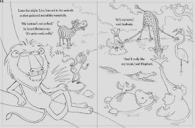
I've been working for several days on my sunset spread, the penultimate spread of The Jungle Grumble. I have drawn plenty of sunsets in my sketchbook in recent years, so had plenty of colour reference.
I began by blocking in some basic background colours. I wanted the yellows and pinks of the sky to reflect in the waterhole. This will of course be really pretty but, because the water fills the page, it also keeps a night time spread bright and colourful instead of dark and dingy.
You can just see the tracing of the drawing through the pastel. The pencil line has been 'fixed' in advance, so I can rub out areas of unwanted background colour, without rubbing out my guidelines.
When colouring the animals, I started by substituting lilac for all the whites, but I was feeling my way with the night palette, not wanting it too be too lacking in contrast, so I decided to lay down more or less normal colours for them, then fix everything, before working back on top, damping things down with purple shadows.
It's best to get everything covered before you fix, since you don't want to fix the same area twice if you can help it, because of the dimming of the colours each time, so I quickly blocked in Lion's background colours too:
I had to change things a bit from the original rough. If you notice, in the original drawing below, the background immediately behind zebra features a big bush, where the bulk of the text will sit.
This looked like a great idea in line, but immediately I began colouring, I realised two problems:
1: continuity - there is no big bush in the other spread which features this part of the waterhole:
But more important still...
2: legibility - a bush in that position would have to be in full shadow. At that time in the evening, that would be very dark, way too dark for black text to be easily readable.
So, I did away with the bush idea and matched the background more closely to the spread above. Here is the artwork at the end of another day. The fixing has been done and I have worked in the new background, as well as spending a lot of time on Lion in his tree and that foreground corner:
The new background is still not ideal. I know my publisher will prefer no change of colour at all behind the text, but it's hard to achieve a blank area running all the way from immediately above Lion's head up to the top of the page, not one that makes sense anyway. As it is, I have had to reintroduce the mist from the previous spread, to filter out all detail around the tree-line.
I think I will have to wait until the artwork is scanned and I can see the text in place. Then I can do whatever is necessary to minimise tonal contrasts immediately behind the wording, using the wonders of Photoshop.
I'll show you how the finished artwork looks next time.
I think I will have to wait until the artwork is scanned and I can see the text in place. Then I can do whatever is necessary to minimise tonal contrasts immediately behind the wording, using the wonders of Photoshop.
I'll show you how the finished artwork looks next time.


5 comments:
Beautiful work! Just love it.
This is the second blog post I have read, but I like your posts! I am a beginner at illustrating and I am learning quite a bit already. Thank you!
Thanks Cindy! You're welcome Jodi - try the 'hot tips' label on the right, where there are various posts which might be interesting, if you are new to things. Also, I have some films on my website, which talk about starting out and getting published, as well as a demo of me doing a piece of artwork to camera, which might prove useful. Have fun and good luck! x
Your sunset is brilliant Lynne, just amazing colours! When you do your photoshop bit at the end, I wonder why you don't do the whole thing in photoshop, like a lot of illustrators do now. I think your pastels look superb and wouldn't want them worked any other way, some digital art looks too ??? untouchable? whereas yours looks like you could walk in there :) I am trying to get to grips with the photoshop, as so much greeting card imagery is produced that way now. :)
Thanks Julie!
Two reasons why I don't work digitally:
1 - I don't want to spend my whole time in front of a computer (I spend long enough as it is!).
2 - digital mark-making is more sophisticated in programs like Painter, but it's still not a substitute for real pastel or watercolour. Photoshop is not really the best software for complete illustrations to be honest, though some people do use it to good effect if they want a more graphic style. Adobe Painter is the best one I have found for anything for 'painterly'.
Post a Comment