Showing posts with label roughs. Show all posts

Friday, 18 December 2015

Nearly a Sticky End for 'Class One' (and Me)!


The roughs for Class One, Farmyard Fun are finished! Well, what I mean to say is, they have all been drawn up and submitted to my publisher. You never know at this stage whether you are actually finished or not - it is not at all unusual for there to be quite a few changes needed. We''ll see. This is the opening spread:


Actually, I had a bit of a false start - I thought I was finished, somewhat prematurely. I was just reading through everything with John, in preparation to emailing the roughs off to Hodder (it can be very useful to have a 2nd pair of eyes - John often spots things I've missed). It was all looking good though. Lots of chaos and plenty of children flying through the air...


Anyway, we read the last spread and the story ended rather suddenly. It was only then that I realised I had missed off the end! There's always a final single page, the one you get after the final spread. It's not always used - it depends on the book and the length of the text. In this series of books, that final page is always a sort of cautionary ending, sometimes with the hint of a sting in the tail. 

I worked out what went wrong: when my art director printed me a slightly reduced set of layouts to work from (blank pages with just the text), the single page had got forgotten at her end. I didn't notice because of not working through the illustrations in order. 

So, I had to go back to the drawing board (literally) and get scribbling again. This is what I came up with (the little girl will of course be wearing a red dress):


Saturday, 14 November 2015

Class One, Farmyard Fun: Mapping the Farm


In between my residency sketching days, I have been working on the roughs for Class One Farmyard Fun, my new picture book. It's another one by the lovely Julia Jarman, our 6th collaboration. It is full of all the usual fun and mayhem which Julia writes so well.


The action involves an escaped bull who moves around the farm, chasing various children and tossing then into the air. I tried to make a start, but was having trouble getting my head around the 'geography' of the story. I realised that I needed to create a map of the farm, so I could establish the layout and know which animals were where (ignore the 'flying' truck on the map by the way - that's me drawing a bit of reference off Google Images): 


The map was instantly a great help. As I'm working my way through the drawings though, I am occasionally having to go back and make changes to the farm's layout, so that certain things will fall alongside others which are juxtaposed in the text. 

For instance, I originally sited the whiffy muck-heap to the left of the bull, under the trees by the lake. The sheep had to be nearby, because Julia's text mentions them both on the same page:

They saw a lot of woolly sheep
And a cock on top of a whiffy muck-heap.
But they didn't see...

But this bit of text comes immediately after a page about the bull, so the two bits of the rhyme are on either side of a single spread. This is the first bit, about the bull:

...the bull in a strop.
They didn't see the big bull frown
Watching Class One walking round
Some of them wearing red
Which makes bulls cross - or so it's said.

I started off drawing this spread as two single pages, but there was such a lot of text to work around on the bull page, I couldn't get it to work. 


So I combined the two sets of drawings and turned it into a spread instead. Which meant going back to my map and moving the muck-heap and the field of sheep over to the right of the bull. Unfortunately, this change had a knock-on effect on an earlier page, but at least I had got things to work at last.

This is not the finished rough. It's early days. I get better as I go along, so often come back and re-draw the earlier spreads.

Thursday, 6 February 2014

How to Illustrate a Picture Book: Creating Different Animal Characters


Yes, John has been editing like a demon and we have now finished the 2nd of our two new films about creating a set of roughs. This one tells you how I designed some of the many animal characters for Jungle Grumble. If you are new to my blog, Jungle Grumble is the latest book I have been working on with author Julia Jarman


In this 2nd film, I show you how I begin with photographic reference and how I play around with facial features in particular, to turn each animal into a character more suitable for a picture book:


We shot the footage for this film back in September, at the same time as the one I published last week. I had just finished all the line-drawings and had submitted them to the publisher, so it seemed a good idea to talk about the process while everything was fresh in my memory. 

But both films got put on a back-burner for a while, because of school visits and festivals. Then suddenly I had my artwork deadline to meet. We finally got round to editing them a couple of weeks back, while I was still having to sit around, because of my bad foot

Anyway, I really hope you like our efforts. We have over 1000 views on the first film, which is great:


Please, please, please - if you enjoy the films, do share the links and tell your friends!

The next film to be uploaded to my YouTube channel will be another demonstration with pastels at my drawing board, showing you how I turn one of my roughs into a piece of finished artwork. Let's hope we get that one edited together a little more swiftly for you!


Wednesday, 22 January 2014

New Film: How I Design My Picture Book Illustrations


Yes, at last John and I have got another film finished - hurrah! 

I thought it might be interesting to use the work I have been doing on Julia Jarman's story, Jungle Grumble, to talk people through how my picture book illustrations are created. 


This is the first of two films about creating a set of roughs (the next one will be out in a week or so). This first film talks you through how I get from a simple sheet of typed text, emailed from the publisher, to a set of finished designs. 

I show you how thumbnail drawings work as a great way of capturing first thoughts, then how those are enlarged and redrawn in various stages. I talk about using a layout template and how I work around the text and the central gutter. I don't like to draw at a computer, but it is still an invaluable tool and I explain in the film how I use it to move the drawings forward.


The films John and I have created over the last year have been made as a direct result of writing this blog. Telling my readers about what I do has been really useful for me, as it makes me analyse my process and consider precisely what it is I am doing at the various stages. When you've been doing something for so many years, it can be hard to explain it to other people, because so much of the process becomes second nature.

If there is any aspect of my work which you would like to know more about, do please let me know. In the meantime, I hope you enjoy the film. If you do, please leave me a comment. And it would be wonderful if you could help me by spreading the word on Twitter, Facebook etc, because every little helps!

Wednesday, 15 January 2014

Two Alternative Endings in One


Remember, there was some conversation about changes to the end of Jungle Grumble? We had a slight problem pleasing the German publisher, who is doing a co-edition. Julia came up with alternative possibilities, but they were all rejected. 


Above was the original rough for the final spread. In the end though, I created the final spread with just the lion asleep. No thought-bubble joke. The thinking is, we can have two different versions. This slightly boring end was what the German publisher wanted (along with altered text that, for our market, rather over-explains the moral). For the UK edition though, we can have our own text and add back the visual joke. 

Of course, we can't have a different piece of artwork for the final spread - that would be prohibitively expensive. But there is an answer - there is an extra, single page available, after spread 12. The plan is to add back the joke for the British version, as an extra piece of artwork, on this final page.

But my Art Director asked me to do a re-draw: she felt that Lion's fantasy multicoloured mane / stripy coat idea was not enough, that it would be better if Lion was made up from parts of the other animals instead, showing that he too has a secret desire to swap.

I tried out various possibilities, narrowed them down to these three and have sent them off:


There is something bothering me though: the actual 'thought-bubble' has been removed from around the fantasy lion. Without it, I worry that the reader will be confused. Now that the sleeping lion is no longer on the same page, there is nothing to suggest that this is a dream / daydream. It looks as though somehow he has actually swapped. Which doesn't make sense with the rest of the story. I have passed on these concerns. We'll see.

At the moment I am still working as best I can from an armchair, with my foot up, wedged under a bag of frozen peas, but next week I have the dressings off my foot and my stitches snipped. Come Monday afternoon, I will be able to put on a shoe (and have a shower!) for the first time in 2 weeks. I should be able to sit at my drawing desk too, at least for part of the day, so I can get on with the front cover artwork. 

Monday, 13 January 2014

Jungle Grumble: Designing a Front Cover


The rough I sketched out last week has been approved - hurrah! Piccadilly Press has been working in close conjunction with a German publisher, so it had to be approved by their team too. 

They sent me this idea, which I think works pretty well, so most of the work was done already. I love the flamboyant text, picking up colours from the animals:


The hippo has been taken from a section of my existing artwork, from spread no 8 - the mega-parade. If you look closely, you can see that the texture is very peculiar in places. That's because the designer has done a quick Photoshop job on it, to get rid of things they didn't want. You can see what's changed by looking at this detail from the original illustration:


I popped the monkey/giraffe character it next to Hippo, instead of the elephant, to add more colour, with his dappled neck and flamingo wings. He was the only other character with sufficient height to tuck neatly into the space next to the title. I've created a little more room for our names too. Here's my sketch:


I still can't get up into the studio, so the artwork will have to wait another week. It shouldn't be too problematic to do though, since it's pretty much just copying the existing characters. I'll keep you posted.

Monday, 23 December 2013

Difficulties Agreeing an Ending


Last week, I finished the final piece of artwork I could for Jungle Grumble. This illustration comes quite early on in the story, where the animals first get into the changing room and begin to experiment. Lion has got fed up with hanging around waiting for them to emerge (it's the spread before this one): 


But there was still one spread outstanding, waiting for approval: the final spread of the book. My publisher, Piccadilly Press, has been negotiating the ending with a German publisher, who they signed up for a co-edition, as a result of the Frankfurt Book Fair. 

This was my original rough, illustrating Julia Jarman's initial ending (the idea is that, despite his wise words earlier, in his fantasy, Lion is wildly multicoloured):


The hold-up has occurred because the Germans are keen to have something less jokey and more moralistic. Julia has come up with various other endings, but nothing has proved acceptable. In the end, Piccadilly have agreed to keep the illustration element simple, which will allow two different endings to be created, using text changes alone.

This is the image we have now: just the lion in the tree (the text is the UK version, left over from the first idea above, the German text is far more along the lines of 'be thankful for what you have'):


To be honest, I am a little concerned that, by removing the fantasy joke, it could leave our version with a rather limp ending, but hopefully Julia can come up with something clever for the text, to make the UK edition sassy again. Julia is really good at this stuff, so I am casting misgivings to the back of my mind, remaining confident and getting on with the colouring up.

I have been desperate to get the go-ahead for this final spread as my artwork deadline is tight. It's because I am having another foot operation on Jan 6th, which means I will lose a minimum of 2 weeks working time, sitting with my foot in the air, packed in ice.

In the end I only had 2 days last week waiting around, without being able to work. To be honest, that was pretty handy at this time of year. So now, Christmas shopping all done, I am back down to it. I have around 2 weeks working time to do this spread 12 artwork, plus design and pastel the cover artwork. Then, after a final continuity check and general touch-up, all the artwork has to be packaged up and sent off to Piccadilly Press, for Feb 1st.

Monday, 16 September 2013

Illustration: Tracing-Up, Ready for the Artwork


I have started my pastel artwork for The Jungle Grumble. I am only doing 2 pieces of artwork at this stage, to be taken to the Frankfurt Book Fair by my publisher. I have just enough time to get it done. Because things are tight, John has been helping me with jobs, like cutting my pastel paper to size: 


I generally work larger than the actual size. On this book I am doing my drawings at 120%, although one of the 2 images the publisher has chosen for their Frankfurt presentation is the very complex 8th spread, so I'l be doing that at 140%, so I can manage the detail:  


Another job is getting the prints-outs of the roughs ready for me to trace. We only have an A4 printer. By the time the line-work is enlarged to the scale I am going to work at, the image is pretty big, so we have to print it out in several bits and then stick them back together again. The image above was in 6 pieces! To get them to line up accurately, we use the light-box:


I then have the extremely tedious job of tracing the illustrations up onto my pastel paper, again on the lightbox. I have to turn out the lights and pull the blinds, to make it dark enough to see through the pink pastel paper, which is about as thick as watercolour paper. If you want to know why I use pink, read this post, from when I was at the same stage with Dragon's Dinner.

Next job: pastels!

Thursday, 12 September 2013

Composition: the Problem of Relative Sizes


I had a bit more trouble with one of my Jungle Grumble spreads that the others and I thought it offered a good opportunity to talk about issues around composition. 

It was the penultimate page: the animals have all swapped back and decided that they are much better off that way (of course). My original thumbnail looked like this:


But Julia Jarman's text begins, 'Later that night, Lion listened to the animals as they gathered at the waterhole.' then it follows on with their comments. I realised that Lion needed to be on the left. So I flipped it:


I wasn't happy though - giraffe didn't fit (she needs to be standing in the water to squeeze her legs in), Hippo was too close to the gutter but, if I moved her, it left poor Zebra out on a limb on his own. 

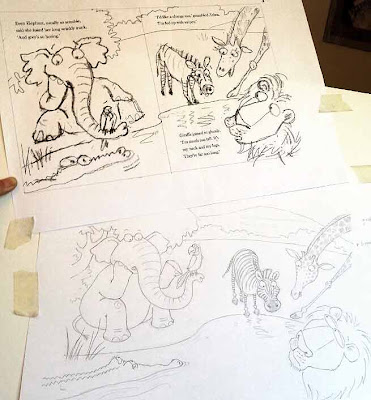
So I shrunk Giraffe a bit and shuffled things around. I moved Parrot from Elephant's head to Croc's, for more humour, moved Monkey to Zebra's page, but it just didn't hang together and was all a bit dull:


There was also the issue of whether to draw naturalistic or non naturalistic poses, now the animals are all back to normal. As you can see, I tried mainly naturalistic, but it was proving hard to make that fun.

The biggest issue though, was the relative sizes of the animals. When you have a cast of very different characters, it's a logistical nightmare fitting them all in so the smallest aren't visually dominated by the largest. Which is why Giraffe and Elephant are at the back. 
But to make Giraffe fit, she was getting so small that she felt detached from the action. I thought about having her sitting on her bottom at the water's edge, but when I sketched it, it just looked weird - too unnaturalistic!

As I added the characterisation, things at least started to look a bit more happy: 


I got the idea of putting Giraffe waist deep in the water, so I could bring her forward, but she needed to be doing something fun. I thought I could have her being spurted by Elephant and splashing him back, but this also proved tricky. Her arms were too long to look right splashing. I tried many times without real success:


Over lunch, I showed my problems to John. He didn't like the splashing sketches either, but suggested drawing Giraffe drinking, like they do, with their legs splayed. I'd used this pose earlier in the book, so had disregarded it as a possibility, but things were getting desperate: I tried it... 


Hey presto! Thank goodness (and thanks John). 

Not only did this fit her in, it also brought her head down to everyone else's level, so she's part of the fun. And the splayed front legs draw your eye in a circle around the ring of animals, joining together the disparate elements in the composition, which was otherwise in danger of looking 'bitty'.

Let's pray my publisher likes it and I don't have to start again!!

Sunday, 8 September 2013

Illustrating a Picture Book: Creating the Roughs


Hurrah - all done in time and emailed off to the publisher!

All those very tiny thumbnails I showed you earlier were scanned and enlarged in Photoshop to 75% of the actual book size:


I then used print-outs of these as a guide, to help me draw everything again, reworking the compositions and correcting mistakes where needed. You can just see the enlarged thumbnail showing through my layout paper:


It was also at this stage that I was adding the new characterisation to each animal, as I went along. 

The finished pencil drawings were then re-scanned and enlarged to actual size, then taken back into Photoshop for last-minute tweaks and scale adjustments, as well as the fine-tuning of the text placement. 

When I was doing the original thumbnails, this was the spread I was most nervous about. I left it to the very end, because there were so many animals to try and fit in it: not just the 10 featured ones, but sundry others to act as the audience:


I had to find a way, not just to squeeze everyone in, but also to show off their various 'swaps' in a way that let you see everything clearly, to avoid visual confusion (whilst still remembering not to put anyone's face anywhere near the page gutter). Nightmare! Only, actually, when it came to it, I managed okay. Maybe because I had warmed up on the rest of the book.


The one that was redrawn the most in the end, was this one, which at first glance looks the most straight-forward:


I'll tell you why next time - you'll just have to wait!

Thursday, 5 September 2013

Designing a Picture Book Spread: Placing Text


I thought it might be interesting to use my work on Jungle Grumble to talk about how I design around text. One common error made by would-be children's book illustrators, is forgetting that quite a lot of space needs to be created in your illustration for the words.

This can be a challenge if the illustrations need to be busy. Though ideally the text is evenly spread through the book, this is not always possible, depending on the action. Some spreads can end up very 'text-heavy'. Others have lots of dialogue and all those new lines make the text expand down the page:


Before I put pencil to paper, I always ask my publishers to set the book's text in the chosen font, at actual size, so I know exactly how much space is needed. I then create blank templates for each spread in Photoshop (as above, with the gutter clearly marked), into which I place the text.

Obviously, until I have drawn the illustrations, nobody knows where the text needs to be positioned, so I am okay to move it around, as long as I follow basic design rules (like keeping an appropriate distance from the top / edges / gutter). 

Mostly I keep the specified text on the particular spreads suggested by the publisher although, with Jungle Grumble, I did make a couple of changes. For instance, in my brief, this text at the very beginning of the story was split across 2 spreads: 


Which seemed an unnecessarily slow start and, by combining both sets of text into one illustration, I freed up an extra spread for later in the book, which was very handy when we were in the thick of the action.

While doing the first thumbnails, I estimated the text area needed:


I then enlarged all the thumbnails and popped each into one of my Photoshop spread-templates. Dragging the bits of text into the positions my illustration idea demanded, I was able to see where more space was needed and rearrange the compositional elements accordingly. 

Below is the spread that fits the template at the top of this post. You can see how I have divided the block of text into 3 sections, to make it more palatable to the reader and also easier to draw around. I have then placed the proper text in position on the enlarged thumbnail, replacing my estimated, hand-drawn text. This one fitted the actual text really well


Using layout paper over the thumbnail print-out (which is translucent, allowing me to see enough of the thumbnail to guide me, but not too much, so no visual distraction as I redraw), I reworked the illustration, making sure I didn't get too close to the text.

My new drawing was re-united with the text when it was scanned and placed back into the Photoshop template, in place of the thumbnail:


Of course, the designer will now rework the text layout - mine is just a suggestion for how I think it best fits my illustrations. Sometimes it stays as is, other times they have ideas to make it funkier.

Monday, 2 September 2013

Drawing Hands: John Stands (Sits?) in for a Lion


Hands are always tricky. Getting the thumbs facing the right way, drawing the angles correctly, especially the bend of the wrist...

I often find it easiest to look at my own hands and I have a mirror in the studio, so I can pose. But, because of my foot op, I have not been working in the studio. The foot is healing really well, but it still needs to be elevated as much as possible, so I have been continuing to work from my armchair (ever cloud...).

Anyway, earlier this week, I wanted to draw the lion from Jungle Grumble clapping the other animals, as they strut their stuff after their mad swaps. I had a couple of quick goes, but it wasn't looking right at all. I had the upper hand all twisted and even the other one looked a bit odd. 

So, when John came by with a cup of tea, I got him to pose. He had to sit on the floor, to get the angle right. The extra flourishes, in the 'roaring' department, were his own idea (he really threw himself into the role!).


I did a very quick sketch, capturing the shapes but imagining his fingers as being more dumpy and paw-like:


I then transferred the pose to my lion. This is a detail from the final rough of the spread. Much better:


Friday, 30 August 2013

Blue Bottoms and Funny Faces


It sometimes makes me laugh: as an illustrator you catch yourself having very serious conversations about the funniest subjects. This time it was blue bottoms. Julia Jarman wrote a Blue-Bottomed Baboon into The Jungle Grumble. He of course wants to swap his bum for something different (he ends up with Zebra's stripy tail in its place, but that's by the by).

The thing is, when I did my photo-search for reference, not one single photo of a baboon's blue bum came up. There were plenty of the disturbingly swollen, red ones, which look like they've been inflated (built-in cushion?), but no blue ones. However, a photo of a mandrill's blue bottom did appear. I hadn't heard of a mandrill: it's a bit baboony, but with a face like an explosion at a cosmetics counter.

A bit more research told me that there was no such thing as a blue bottomed baboon. So I emailed my publisher, who emailed Julia, who texted me. According to Wikipedia, the mandrill is often referred to as a baboon, so we thought we could get away with me drawing the mandrill instead. That suited me, as mandrills look so bonkers. Also, to be honest, I don't especially like drawing baboons: their faces are hard to get right (I drew baboons-in-pantaloons in Lark in the Ark). 

That's when I did this sketch of a mandrill's head (on a giraffe's neck, naturally).

The only snag is that mandrills don't have monkey tails - they have short, rough tails, more like a goat. I thought that might be a little bit confusing in the final illustrations, especially given that our mandrill would have to give his tail to someone else when he swapped his bum. 

More emails...

I was just discussing the ethics of sticking a baboon's tail onto a mandrill, when my editor found another blue-bottomed monkey. 

The lesula monkey was only discovered in 2007. It has a perfect monkey tail and a slightly less obscene-looking bottom than the mandrill (if you ignore the rather prominent, blue dangly bits - I won't be drawing them):


So we decided to change again and use the lesula monkey. Since nobody will have heard of a lesula, we are going to just call him Monkey. This was my first sketch of him:


His face is equally as funny as the mandrill's, just in a different way - sort of weird, with hauntingly human eyes and a puff-ball head:


After a few more drawings to better develop his character, this is what I think he is going to look like in the book:


Sunday, 25 August 2013

Characterisation - Turning Real Animals into Picture Book Characters


There are 10 different animals featured in The Jungle Grumble. I collected lots of photo reference via Google Images (how did we survive before?) to help me sketch the animals into my 'thumbnail' roughs. Of course they were only titchy, as each thumbnail spread, like the one below, is only about 2 inches high. 


I was drawing much larger versions of each animal when I was designing the crazy combos, but at that stage I wasn't fretting too much about characterisation, just visualising how the 'bits' might fit together: 


All this has proved a great way to loosen up. Usually, I start work on a new book with the characterisation, which is by no means the easiest part. This means that I generally have a day or two of agony and extreme grumpiness, before I warm up (John gives me a very wide berth!) 

This time, having planned all my spreads in miniature, I then went back to sort out the characterisation. Because the swapping will make the illustrations quite complex and tricky to 'read', I don't want to dress the animals (usually a good way to help establish character), or even to accessorise them, as I did in An Itch to Scratch where the animals were unclothed. 

Which means that it all has to be done through face and body language. You can see from the sketches here, that I draw the face of the creature again and again, trying different things out:


The idea is to use the photo reference to get basic shapes and key features that make an animal look, well... like itself. Then I play around with nose shapes, eye height etc, creating variations on the theme. Each time you alter a feature, you get a different, unique individual, which suggests a different personality. Some look more male, some female. Some are more successful, others not. Generally speaking, they get stronger with each drawing.


This is a very important part of the illustration process: the reader has to believe in each animal, not just as any old giraffe, but as a specific giraffe. I get the personality started in my sketch then, if it is 'alive', the reader will enlarge on this in their imagination.