I've been spending too much time glued to the computer, so allowed myself some experimental drawing time today.
 I played around with oil pastels this afternoon: in some ways similar to my chalks, but in many ways totally different. One difference is that they melt if you try and work in the garden on a sunny day (note to self!).
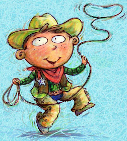
I'm not happy enough with the oil pastel bits yet, but I will show you some digital painting I've been trying out tonight. For speed, since I'm interested primarily in style, I thought I'd work with a pre-existing sketch. The cowboy above is from an unpublished project.

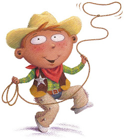
I coloured the character first, in Corel Painter. I had no real plan, just playing really. Then I imported him into Photoshop where I warmed the line colour and created a background. I was quite pleased with him in the end and he only took about an hour. Here is how I originally drew him, in pastels:
 I'm really pleased that the digital one came out quite different. Dare I ask which you like best??

I coloured the character first, in Corel Painter. I had no real plan, just playing really. Then I imported him into Photoshop where I warmed the line colour and created a background. I was quite pleased with him in the end and he only took about an hour. Here is how I originally drew him, in pastels:
 I'm really pleased that the digital one came out quite different. Dare I ask which you like best??
i really like them both, but I am always partial to the traditional medias. The pastel has so much richness. Though the digital piece has a lot of movement from the mark making. Its tough, they are both great!
ReplyDeleteHow could I pick a favorite?! They are all so fun and I love all of the styles. Truly.
ReplyDeleteI like them both too Lynne, but interestingly I would not have instantly thought you were the illustrator if I had only seen the first one... it looks very different with it not being done in pastel. The different style gives it a whole new feel.
ReplyDeleteI think it would be interesting to see a full picturebook done like this. Is this character already in a book?
Thanks guys!
ReplyDeleteI'm pleased to hear you wouldn't have known Damian - I tried to make it look entirely different.
He was originally drawn for a book called Playground Prairie, that was to be the sequel to Open Wide by Tom Barber. Sadly, it got pulled at the last minute, when Chrysalis got into difficulties.
Really glad you did this posting today!I have recently purchased a 'Wacom' and intend to do exactly as you have, as both a learning curve and to see how differently the images turn out. So this was very interesting technically as well as visually, thanks!
ReplyDeleteHonestly think I still prefer the original, but isn't it amazing to see whats possible digitally these days?
I really like them both too!! They are quite different. I can't decide which one I like best. He's a great character!!!
ReplyDeleteThe pure pastel is so 'your work' and I woud pick it out anywhere. I like it best because it's cosy and I know it and trust it. However, the digital drawing is attractive and pleasing to look at. Brightly coloured and pleasant, but different. That isn't much help at all is it?
ReplyDeleteLike the others, I like them both. But maybe the original one for a younger picture book, because it's got a warm, cosy feel, and the digital one if it was for an "early reader" for slightly older children, because it's a bit more quirky and "cool"!
ReplyDeleteInteresting feedback, thanks!
ReplyDeleteYou'll love that tablet Joanna, and wonder how you ever did without it!
Lynne, they are both amazing but I prefer the original one, it has a warmth to it that the other one has lost, saying that though the digital image has gained a quirkiness so I suppose it depends on what you are trying to convey..
ReplyDeleteI too usually prefer traditional media, but I have to admit I like the digital one--the background is so rich and full of movement, which complements the movement of the boy. The colors are also a tad warmer and brighter and share some of the texturing with the background.
ReplyDeleteIts hard to choose a favorite. I like the face of the cowboy with the pastels. And his body with the digital painting. They are both great pieces and I guess if you had to choose, I'd pick the one you found the most fun to create! :)
ReplyDeleteI love both of these illustrations, I don't think there is a "best". They both have different feelings to them, and they both work very well! :)
ReplyDeleteI agree with Maurice. There's something about the pastel textures and then the digital has a great relationship of the lasso and background.
ReplyDeleteThe digital could be for older people and the pastel seems for younger minds.
By older I mean years not decades but he also could be for adults in a way.
ReplyDeleteHow about scanning in the pastel version, opening it in Photoshop and adding a touch of digital - a background and some pattern perhaps?
ReplyDeleteThen you have a 3rd option just to confuse things further :o)
Interesting idea June, but I think the pastels have a completeness - their success is in the purity of colour and texture.
ReplyDeleteI'm playing around with other media to see if there's something entirely different I can use, not to replace or transform what I do in pastels, but to find an additional, alternative look.
Normally I go for the traditional look but I'm swayed by that fanastic background texture and the texture of colours in his hat, so in this case, for me, it's the digi one!x
ReplyDelete