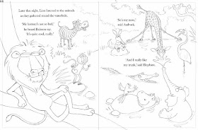
I had a bit more trouble with one of my Jungle Grumble spreads that the others and I thought it offered a good opportunity to talk about issues around composition.
It was the penultimate page: the animals have all swapped back and decided that they are much better off that way (of course). My original thumbnail looked like this:
But Julia Jarman's text begins, 'Later that night, Lion listened to the animals as they gathered at the waterhole.' then it follows on with their comments. I realised that Lion needed to be on the left. So I flipped it:
I wasn't happy though - giraffe didn't fit (she needs to be standing in the water to squeeze her legs in), Hippo was too close to the gutter but, if I moved her, it left poor Zebra out on a limb on his own.
So I shrunk Giraffe a bit and shuffled things around. I moved Parrot from Elephant's head to Croc's, for more humour, moved Monkey to Zebra's page, but it just didn't hang together and was all a bit dull:
There was also the issue of whether to draw naturalistic or non naturalistic poses, now the animals are all back to normal. As you can see, I tried mainly naturalistic, but it was proving hard to make that fun.
The biggest issue though, was the relative sizes of the animals. When you have a cast of very different characters, it's a logistical nightmare fitting them all in so the smallest aren't visually dominated by the largest. Which is why Giraffe and Elephant are at the back. But to make Giraffe fit, she was getting so small that she felt detached from the action. I thought about having her sitting on her bottom at the water's edge, but when I sketched it, it just looked weird - too unnaturalistic!
As I added the characterisation, things at least started to look a bit more happy:
I got the idea of putting Giraffe waist deep in the water, so I could bring her forward, but she needed to be doing something fun. I thought I could have her being spurted by Elephant and splashing him back, but this also proved tricky. Her arms were too long to look right splashing. I tried many times without real success:
Over lunch, I showed my problems to John. He didn't like the splashing sketches either, but suggested drawing Giraffe drinking, like they do, with their legs splayed. I'd used this pose earlier in the book, so had disregarded it as a possibility, but things were getting desperate: I tried it...
Hey presto! Thank goodness (and thanks John).
Not only did this fit her in, it also brought her head down to everyone else's level, so she's part of the fun. And the splayed front legs draw your eye in a circle around the ring of animals, joining together the disparate elements in the composition, which was otherwise in danger of looking 'bitty'.
Let's pray my publisher likes it and I don't have to start again!!


It works a treat!
ReplyDeleteI agree! Much better!
ReplyDeleteLove it.
Goodness, I didn't realise there would be so many elements to try and keep happy. Great outcome though, I'm sure your publisher will love it.
ReplyDeleteWhat a great post:)I learn always something here:) Thanks.
ReplyDeleteThanks for all the valuable information! This was great, seeing all the steps and shifts you made!!
ReplyDeleteLove your work! Thank you for letting us see how your vision progresses. Do you use tracing paper for all these? How do you know what size to make the sheet? I'm writing and illustrating my first book, but I don't have any idea how large or small to make my finished work. Thank you!
ReplyDeleteThanks everyone.
ReplyDeleteI use layout paper Nancy: it's less transluscent than tracing paper, so things get less visually confusing.
Re sizes: everyone works at a different scale, depending on their medium. It's usually the same size as the printed book, or anything up to about 130%.
Re dimensions: these vary, so you shouldn't really do the finished artwork until you have a publisher. They all have slightly different shapes and sizes, so you will end up doing it all again. I would just do one sample spread in colour and few colour character studies and keep the rest as roughs, which is far more flexible. They are bound to want lots of changes anyway.
Good luck!