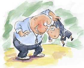
Here is my Illustration Friday attempt for this week's theme of hierarchy:

I thought I'd try a slightly lighter touch than last week, so tried out a new approach with watercolour, quite roughly applied, and then a line added with a graphite stick, like before (make marks a wee bit richer and wider than a standard pencil).
As a style, it's rather more 'cartoony' than is appropriate for my usual illustration work, although once it was done, I realised that it is a lot like the work I've done in the past for children's chapter books.
I like the loose style of this illustration..very expressive and funny. I so enjoyed meandering through your wonderful artwork! I love seeing your experimentation and the results...thanks for sharing!
ReplyDeleteI'm liking this approach. Scary and funny at the same time.
ReplyDeleteIt´s a perfect "cartoony" style, and I like the colours. This is great, Lynne, and I think this is more satisfying, if I may say it, than "theater" post. I love your b&w "children´s chapters books" illustrations. Excelent as all your work. And thank you for your comments.
ReplyDeleteYou make it look easy - a lively illustration.
ReplyDeleteI like this. You are productive, experimental, inspiring and quite successful. I thank you for your kind comments in my direction.
ReplyDeleteThis is cool, nice sense of size and weight being used while maintaining a balanced composition... and really fun.
ReplyDeleteNice Lynne
absolutely wonderful piece. I sat last night reading your adventures and looking at your art...I'm a fan! and now a follower!
ReplyDeleteHey Lynne you've done it again! Fantastic! Love the loose lines and the slightly different washed style. Nice!
ReplyDeleteThank you so much everyone. I was a little unsure about the success of this one, so it's lovely to have such warm and generous feedback.
ReplyDeleteWonderful illustration Lynne!
ReplyDeleteShow him who's boss!
ReplyDeleteGreat image. It's perfect!
these are great!!
ReplyDelete