 On Friday, I got the go-ahead for the educational project I was waiting on (see An American Cover). I have spent just over two days finishing the work and I thought it might be interesting to talk you through the process of creating a piece of my final artwork. (I intended to take photos at stages, but had trouble with the camera, so I apologise for that - another time).
Here's the final rough to remind you:

The client actually emailed last minute changes on Monday afternoon, after they had green-lighted this re-rough: to add indication that the wood pieces come from the wrecked wagon and to reinstate the ears, albeit smaller. Fortunately there was still time to incorporate these.
So, here's how it went:
 1: I printed out my rough and cut to size my pink, textured, Canson Teintes pastel paper. Though pastel drawings are generally best drawn bigger, the actual print width here is 505mm, so I decided to do this artwork same size.
2: I traced up the line work in fine pencil, using a light box, then 'fixed' it (using Rowney spray fixative - why is that stuff so expensive???).

3: I angled my drawing board (so the dust fell away) and donned my overalls (pastels are a messy business).
4: I laid in the sky first, blending different blues and smudging in clouds. I then rubbed out any unwanted blue from the rocks, erasing back to the pencil guideline. This prevents colour contamination and keep things bright (you can just fix it, but each fix dulls the colours, so I try not to, if possible).
5: The rocky background was next. I established a range of warm colours to contrast with the cool sky. I like to juxtapose marks in a variety of related colours, to add vibrancy: various pinks and oranges for the lighter areas, mauves and blues for the stark shadows (I always avoid brown when I can).
6: I rubbed back as before, to re-find the main character and other foreground details, like the cacti and wagon wheel (rubbing just short of the line, being careful not to create a bare 'gap' around them).
7: Finally the objects. The character's fur came first, then the whites of his eyes, then his clothes in bright, punchy colours, chosen to push him forwards. Then the cacti and wagon. It is important to continually work from the back towards the front, leaving details to last.

8: I now fixed the work thoroughly. This altered the colours, but was necessary before any more pastel could be overlaid (it gets muddy and 'greasy' if over-loaded). It also allowed detail to be added crisply.
9: I put dots in the eyes, added eyelashes and whiskers with pastel pencils, drew spots on his scarf, stripes on trousers and cacti etc. I then re-evaluated the tones, now most things were in. I felt the shadows were much too dark (partly the result of working in poor light on the previous, dingy day, partly the fault of the fixative).
10: I went back, lightening the purple shadows and touching up any other loss of brightness that was too devastating. This is the compromise of working in pastels, and the bane of my life. The drawing is either safe from smudging but more dingy than I would like, or I re-brighten it to get back vibrancy, but at the cost of potential damage.
11: Once I was happy that the background will not change further, I added the dragonfly, lizard, beetle and wild flowers.
12: Another, but very sparing spray with fixative, concentrating only on areas that are at real risk of smudging, avoiding the background as much as possible.
13: After a final once-over and any last minute adjustments, I took the drawing to my cutting mat and trimmed the edges to neaten them. I then surface-mounted it onto lightweight card and cut a paper overlay, which I taped along the top edge (essential to take up the blotting-off of the chalk).

14: I raided my stash of big, cardboard boxes, to create a really stiff package, parcelled it all up and called Fed Ex.
15: I breathed a sigh, equal parts contentment and relief, and put the kettle on!
Hope you like it.


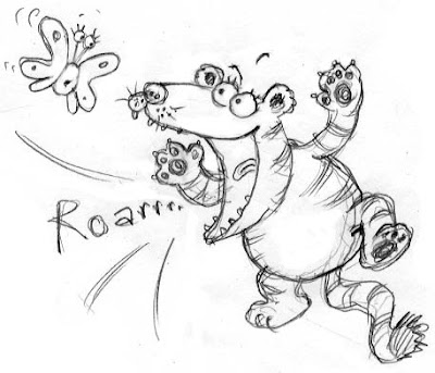
 They are still a little crude, but are only intended to be considered as coloured sketches, not as paintings. This is something I've never tried before, so I am still very unsure about it's validity, but it does seem to add punch to the sketches.


 I also thought I'd try something a bit less complex, so I could concentrate more on the marks themselves, like these feet. Here's a detail so you can see the marks:


 I thought perhaps the boy could be better: still a bit static don't you think? I tried again, to get in more fun, by drawing him bent right over and the snowball hitting his bum instead.


 I did some big drawings for the children, then showed them tips on how to draw Giddy Goat. For the littlies, I had made colouring sheets and everyone had prints of my


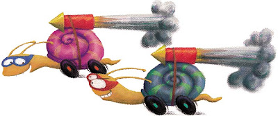
 Well, I was proven wrong yesterday. I did get the day to try out some sketching after all. I have been playing around with some new animal characters for my baby book idea (see
  Because it is aimed at the youngest end of the picture book market, it needs to be much less fussy and detailed than I would usually do. I envisage the characters being large and bold, and working onto plain colour backgrounds, very much like the illustrations in

